
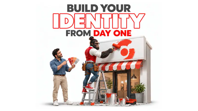
The first posts are designed by a friend, the menu by a printer, the sign by the shop that made the sign. Each looks fine on its own. Put them side by side and they look like three different businesses.
An identity works like a school uniform. The first day does not need a full wardrobe, but everyone has to wear the same colours. This article sorts identity decisions into what cannot wait and what can, gives a day-one kit and a touchpoint audit to use this week, and walks through one example from the first sketch to the first delivery bag.
In short: On day one, a new business needs a clear name and logo, a small fixed set of colours and type, and a page of simple rules for using them, applied first to the places customers meet it most often. A full brand book, patterns and long guidelines can grow later, once it is clear what customers recognise and respond to. Consistency beats perfection: a simple identity used the same way everywhere is remembered sooner than a clever one used differently each time.
Why consistency matters more than perfection
A customer meets a new business in many small places: a sign, a bag, a post, a receipt, a van in traffic. Recognition comes from seeing the same thing again and again, usually without paying attention. Byron Sharp's How Brands Grow (2010) argues that brands need distinctive assets, such as colours, shapes, logos and characters, that buyers link to the brand without reading the name. Jenni Romaniuk's Building Distinctive Brand Assets (2018) adds the uncomfortable part: an asset only becomes distinctive through consistent use over time. Every redesign, every “let's try a different colour for this campaign”, starts that clock again.
That is why the day-one decisions matter more than their size suggests. They are the ones that start building recognition from the first customer.
The day-one kit, and what can wait
The table below is a starting split for most small launches. Use it as a checklist: everything in the middle column should exist, written down, before the first thing is printed.
| Element | Day one | Can wait | Why |
|---|---|---|---|
| Name | Checked for meaning, spelling in Arabic and English, and availability | A naming story | Changing it later is the costliest change |
| Logo | Main version, a small version, one-colour version | Animated or seasonal versions | It has to work on a phone and a sticker |
| Colour | Two or three, with exact codes | Extended palette | So every supplier gets the same red |
| Type | One or two families, Arabic and English | Display or campaign fonts | Type carries the voice in every message |
| Rules | One page: placement, spacing, what never changes | A full brand book | Rules protect consistency when others design |
| Imagery | A few dos and don'ts | A photography guide | Learn first what customers respond to |
Setting it up, step by step
- List every touchpoint. Every place a customer will meet the business in the first months: sign, packaging, uniforms, vehicles, social profile, WhatsApp, invoices, website. Rank them by how often a customer sees each one. It produces a ranked list, which tells the design where to work hardest.
- Lay out what already exists. If anything has been printed or posted, collect it and put it side by side on one table or one screen. It produces a visual audit: what matches, what does not, and which supplier made each piece.
- Build the day-one kit. Name, logo versions, colours with codes, type, tested at real size on the top three touchpoints, not only on a presentation screen. It produces the files and a one-page sheet of codes.
- Write the one-page rules. Where the logo sits, how much space around it, which colour is the background, what never changes. Written for the printer, the friend who designs posts and the sign maker, not for designers only. It produces a page every supplier receives with the files.
- Apply it to the top touchpoints first. The most-seen places get the identity first and get it right. Everything else follows as it is reprinted. It produces a launch where the places customers see most already agree.
- Review after a few months. Ask new customers what they remember: the colour, the van, the bag, a word? Keep what is recognised and build the next layer of the identity from it. It produces the brief for the parts that could wait.
A worked example
This example is hypothetical. A new laundry and dry-cleaning service in Dubai collects and delivers to apartments in a few residential towers, booked by WhatsApp. The founders want a full brand book, a mascot and an app design before launch.
Touchpoints. The ranked list surprises them. Customers will rarely see the website or the app at first. They will see the garment bag at their door, the tag on each shirt, the WhatsApp profile and messages, the van in the tower car park, and the driver's uniform, in roughly that order, every week.
The kit. A short name that reads well in English and Arabic; a logo that still works printed small on a garment tag and in one colour on a bag; one strong colour that no other laundry in the area uses, plus a neutral; one bilingual type family. Tested at real size on a tag and a bag before anything else.
Rules. One page: the bag is always the strong colour with the logo centred; tags are white with the logo in the strong colour; WhatsApp messages open with the same short greeting and sign-off. The page goes to the bag supplier, the tag printer and the van wrap shop.
What waits. The mascot, the full brand book and the app design wait. After a few months, new customers are asked what they remember. In this illustration, most mention the bright bag hanging on neighbours' doors, which has quietly become the brand's most distinctive asset. The next layer, a door hanger for new towers and a guide for the app, is built around that bag, not around a mascot nobody has met.
Five mistakes new businesses make with identity
- Designing for the presentation, not the touchpoint. A logo approved on a big screen fails on a sticker or a phone. It happens because the review happens on a laptop. Instead, test at real size on the three most-seen touchpoints before approving.
- No codes written down. Each supplier matches the colour by eye, and the red drifts to orange. Instead, write exact colour codes for print and screen on one page and send it with every file.
- Forgetting Arabic. The English logo and font are chosen, and the Arabic is added later in whatever font is installed. Instead, choose type that works in both from the start, and design the Arabic name, not just translate it.
- Changing too soon. After a few weeks the team is bored of the colours and wants something fresh. Customers are only starting to notice them. Instead, change only what customers are clearly confused by, and leave the rest alone long enough to be learned.
- Overbuilding before launch. A full system is made for a business that changes shape in its first months. Instead, build the kit, launch, learn, then grow the identity around what customers actually recognise.
When to do more, and when to keep it small
Invest in a fuller identity from the start when looks are part of what customers buy, as in fashion, beauty, hospitality or premium food, or when several branches or a franchise are coming soon and others will apply the brand without supervision. Keep it small when the product or the customer is still changing. The risk of overbuilding is a beautiful system for a business that turns out to be different.
And identity cannot fix an unclear offer. If people do not understand what the business sells or why it is better than the alternative, start with positioning; the look should carry a decision, not replace one.
How OG builds a day-one identity
We start with the touchpoint list and, where something exists, the side-by-side audit, so the design effort goes where customers will look. If the name is still open, naming and verbal identity comes first. Then visual identity design builds the day-one kit and the one-page rules, with the logo tested at real size. Where the most-seen touchpoint is a pack or a bag, packaging design and print production make sure the colour that reaches the customer is the colour that was approved. The fuller system comes later, from what customers remember. Scope follows the need; there are no fixed packages.
The strongest objection
“We will fix the identity when we can afford a full rebrand.” Possible, but every month of inconsistent use teaches customers a blurry picture that later has to be unlearned, and, as Romaniuk's work shows, recognition only builds through consistent use. The day-one kit is small on purpose. Fixing a few basics now is cheaper than correcting many habits later, and it means the eventual fuller identity grows from something customers already know.
Built on: our visual identity work with new brands since 2013; Byron Sharp, How Brands Grow (2010); Jenni Romaniuk, Building Distinctive Brand Assets (2018). The day-one list is our recommendation for most small launches, not a fixed standard, and the laundry service is a hypothetical example.
Before closing this page
- Which three places will customers see the business most often in its first months?
- Are the exact colour codes written down, and does every supplier have them?
- Does the logo still work printed small and in one colour?
- Do the Arabic and English versions look like the same business?
- If a customer saw only the colours, without the name, would they know whose they are?