
Stronger than you think: what actually makes a brand strong, and how to build it
Read the article
A dessert-first café in the UAE, renamed, repositioned and given a complete brand system: where crafted moments flow.
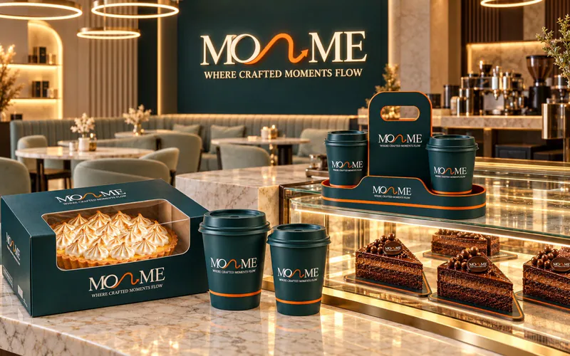
The café started life as “Molten Me”. The name tied it to molten cake alone and put it in the wrong position in the market: one product, not a destination. The owners wanted a café people visit for the whole dessert experience, with a brand strong enough to carry new products, packaging and branches.
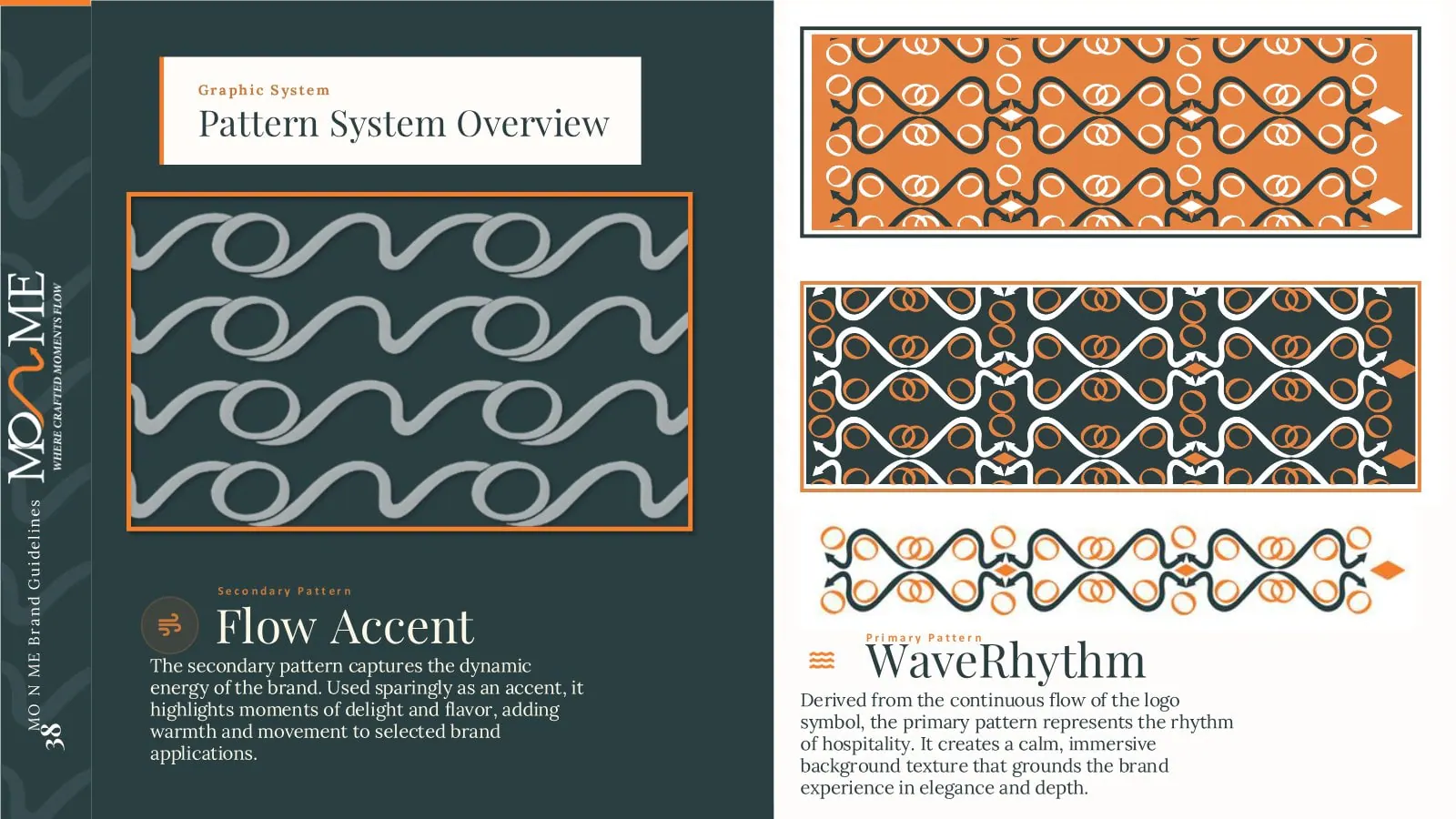
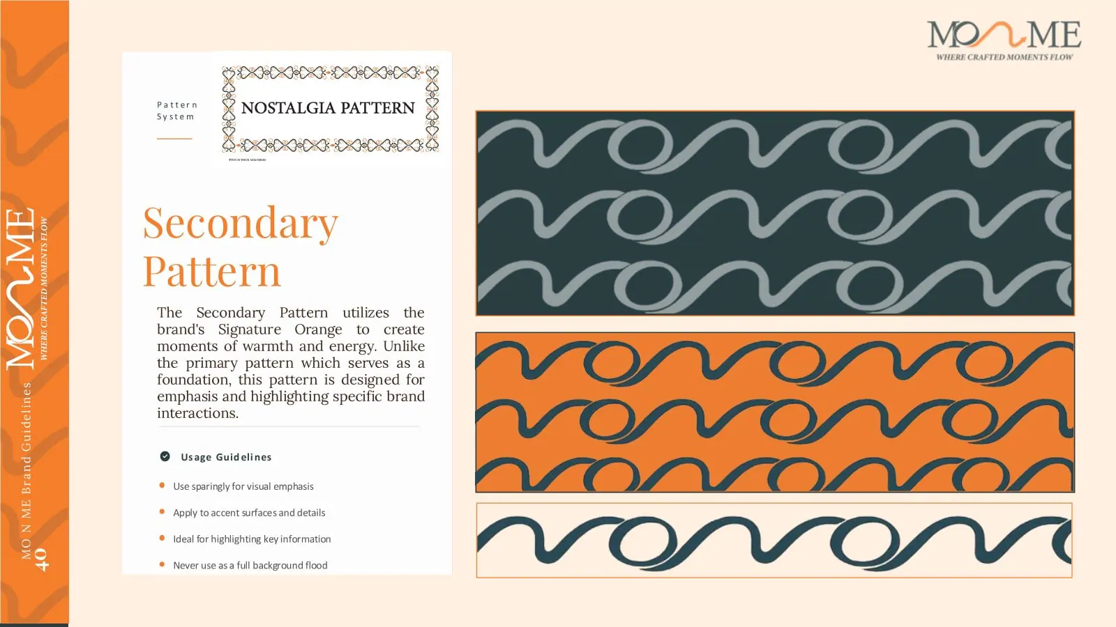
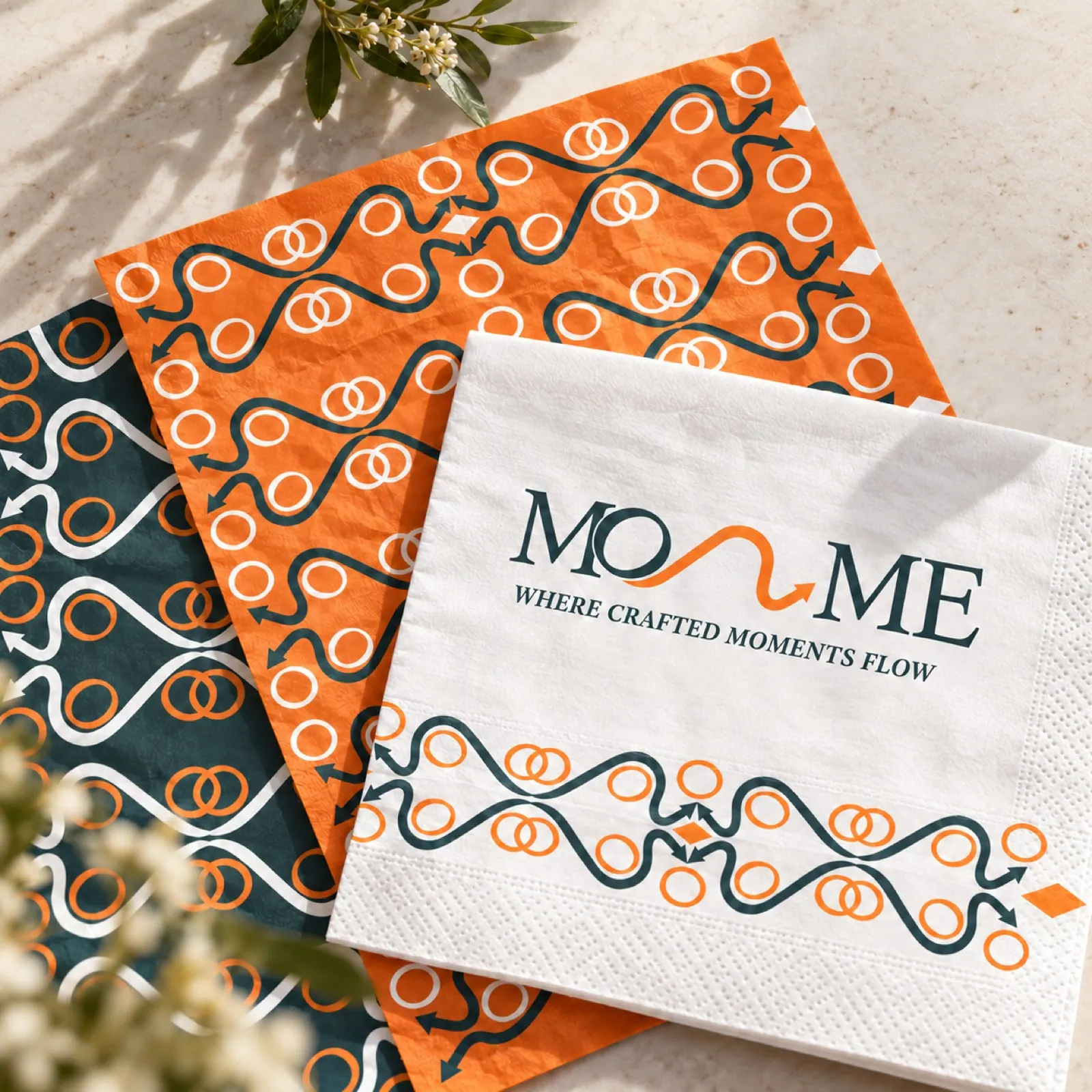
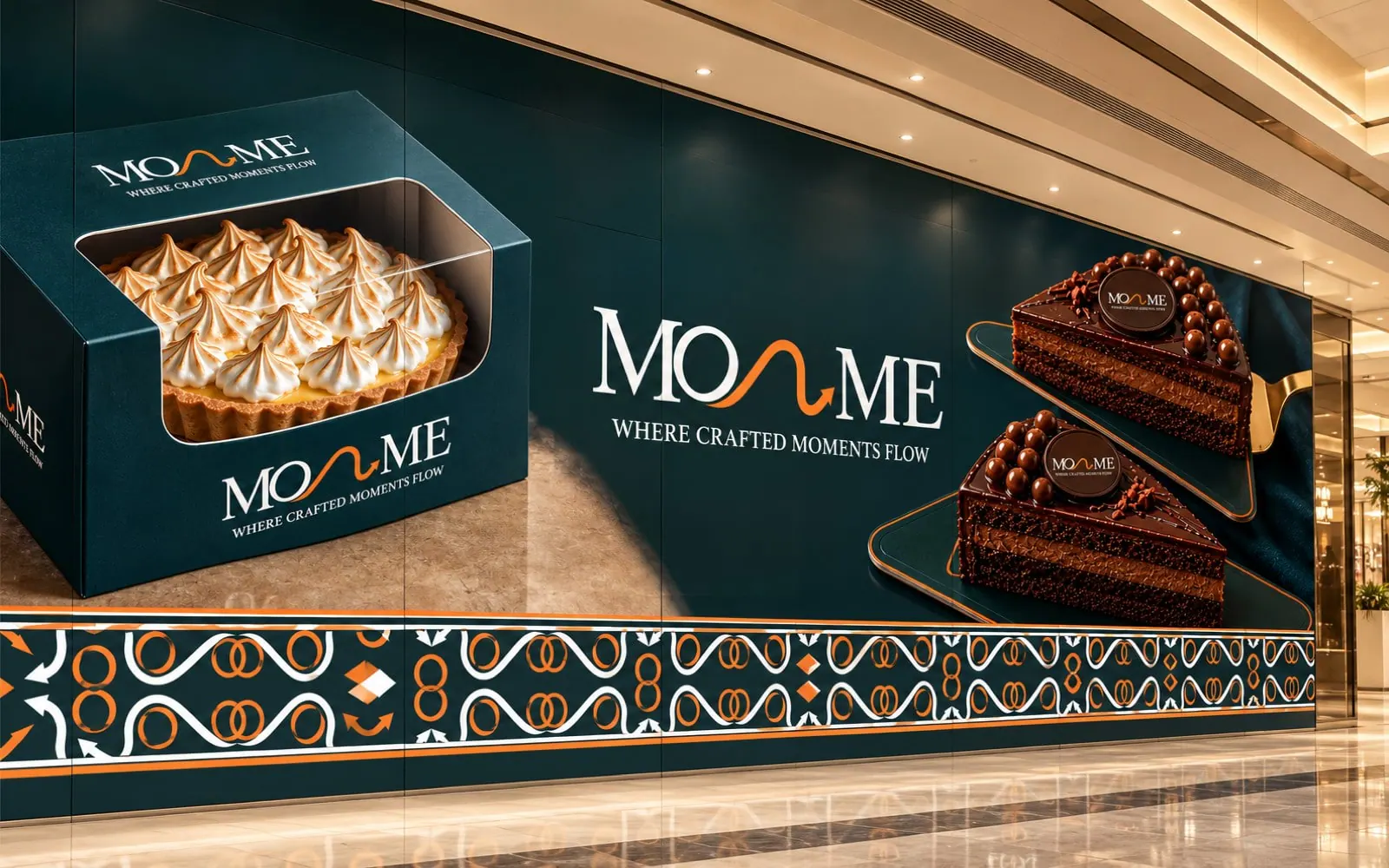
We started from a research file: the market and its competitors, the customer segments, and a diagnosis of how people file the café in their minds. We repositioned it as a dessert-first café and renamed it Mon Me, with the line “Where crafted moments flow”. Around the new position we built the whole system: a logo engineered around a flowing line, a teal-and-orange colour strategy, primary and secondary patterns, packaging rules, art and photography direction, and a guidelines book that keeps every cup, box and post consistent.
The old name tied the café to one molten cake. We repositioned it as a dessert-first café and renamed it Mon Me, so the brand could carry the whole experience: desserts, drinks, boxes and visits.
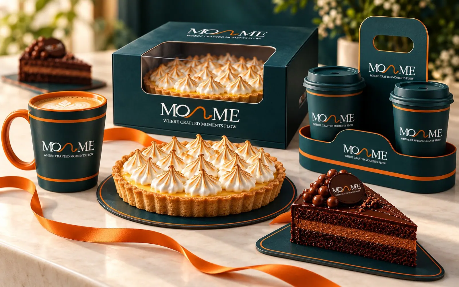
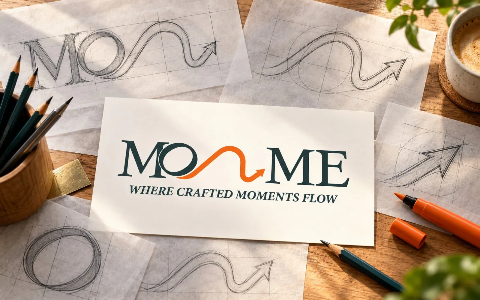
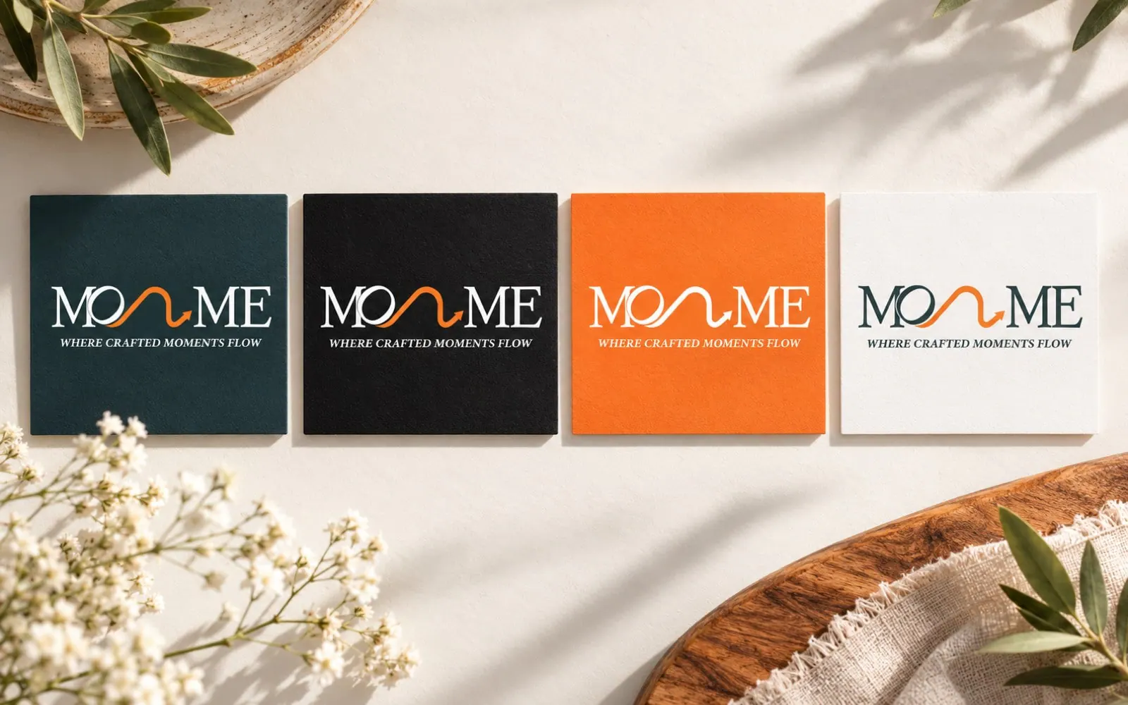
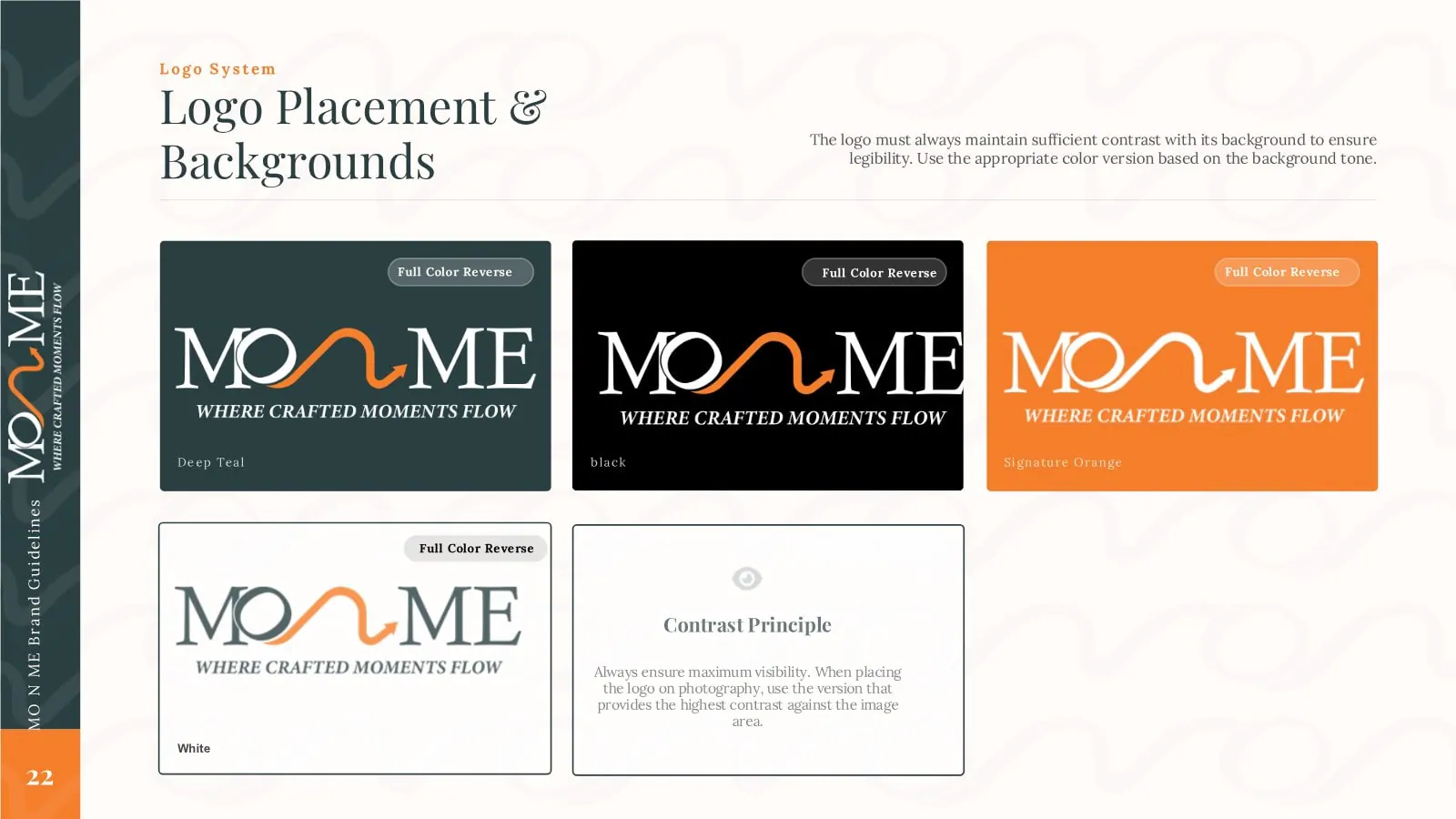
One flowing line links the two words. Deep teal and orange carry the system, on light, dark and brand-colour backgrounds.

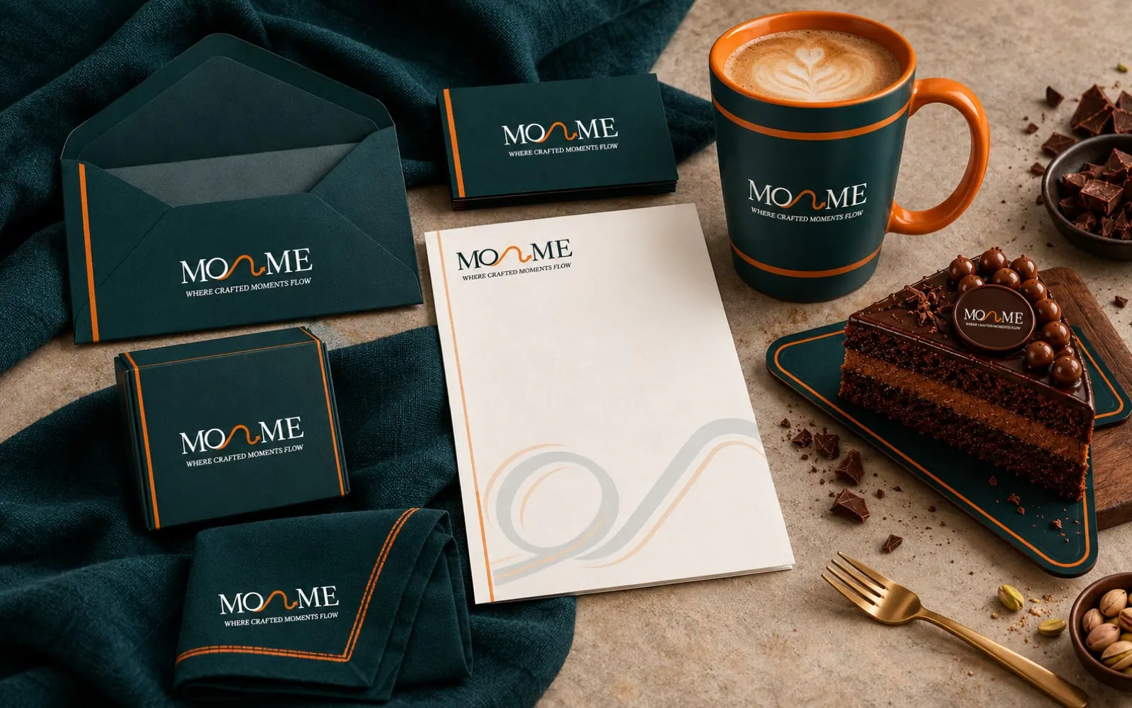
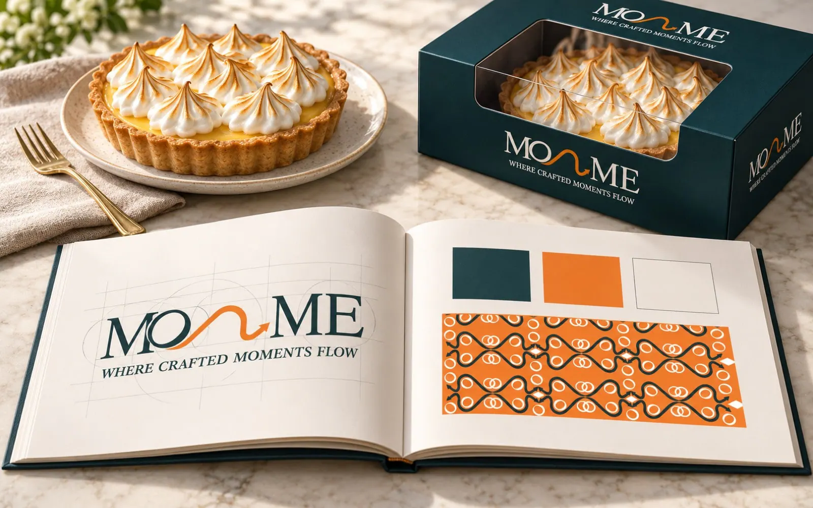
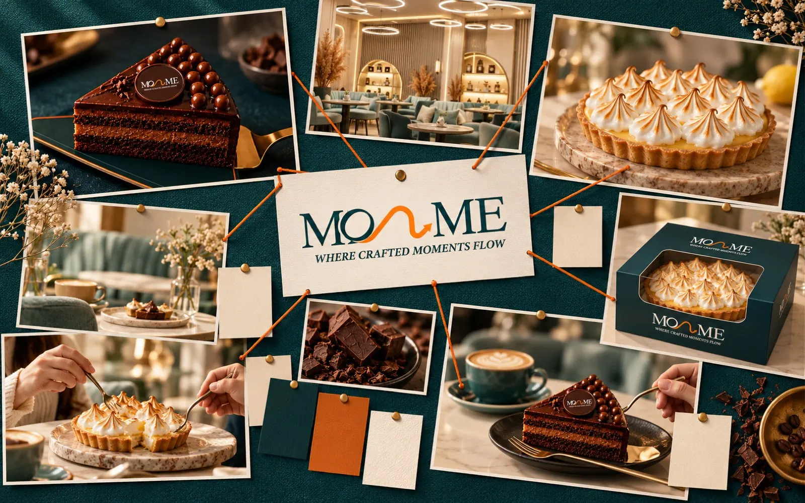
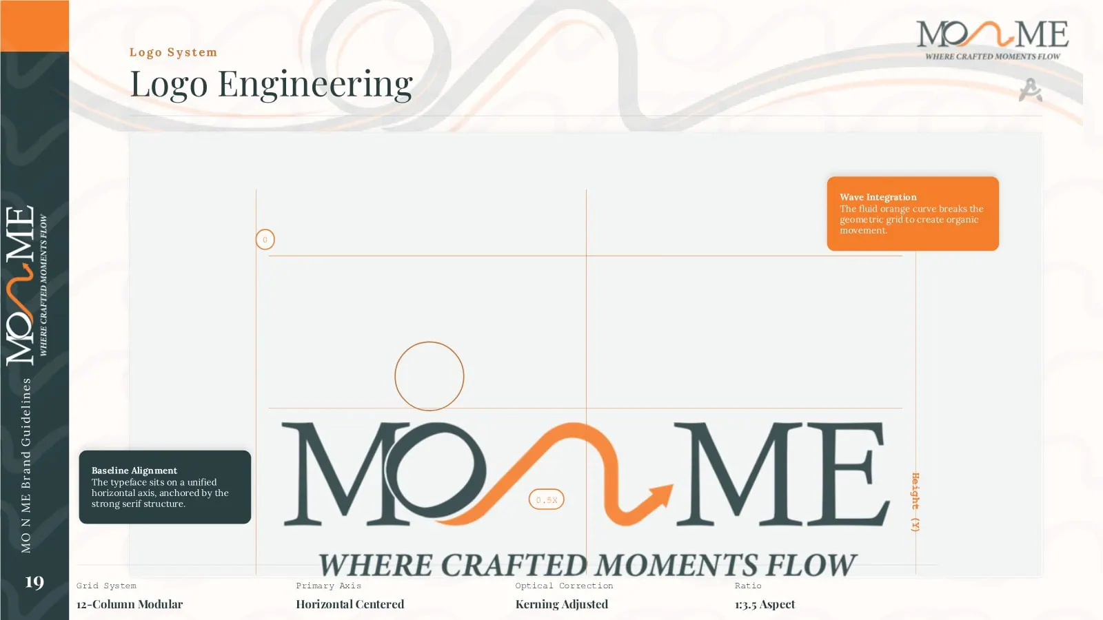
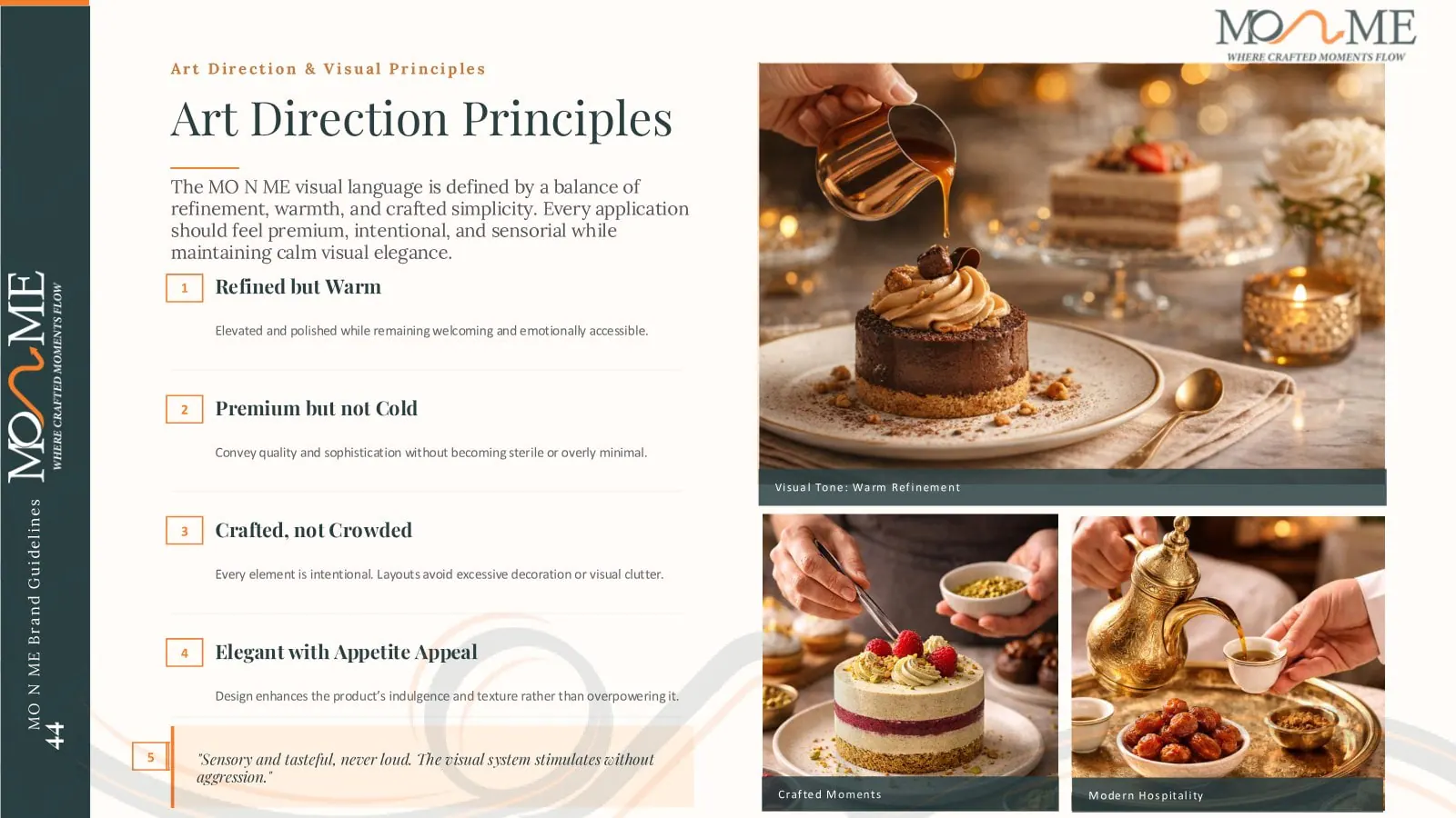
Pages from the guidelines: logo construction, colour, patterns, packaging rules and photography direction, so every cup, box and post stays consistent.
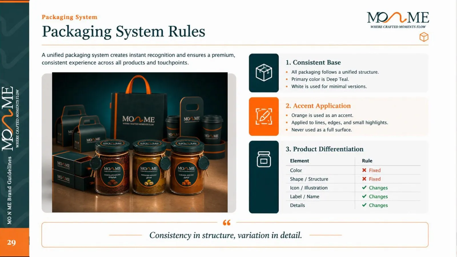
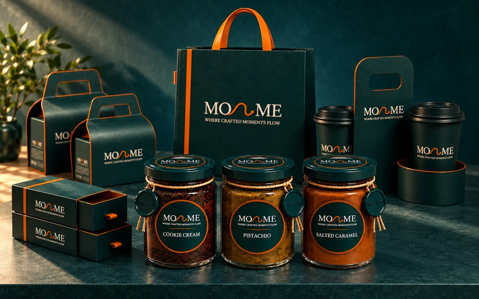
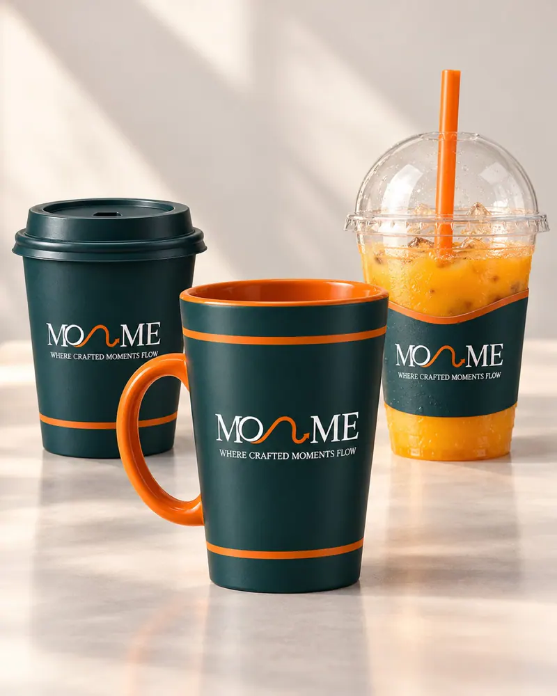
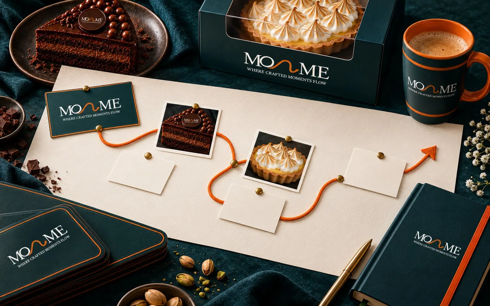
One base across every pack, with room for each product line: boxes, cups, jars, delivery bags and gift sets.
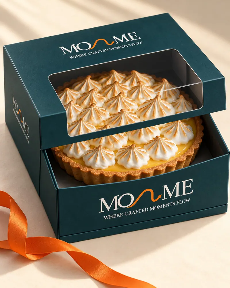
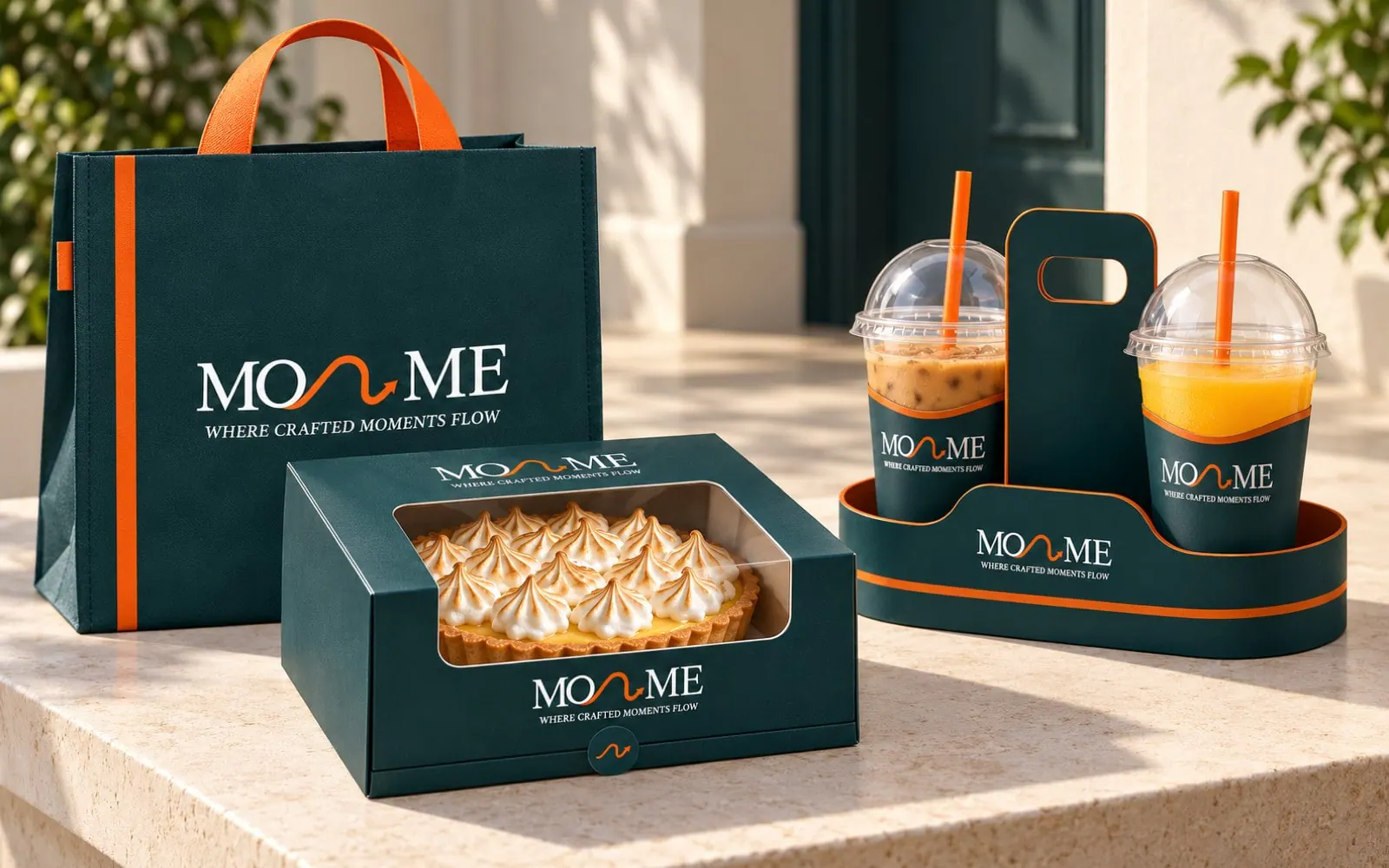
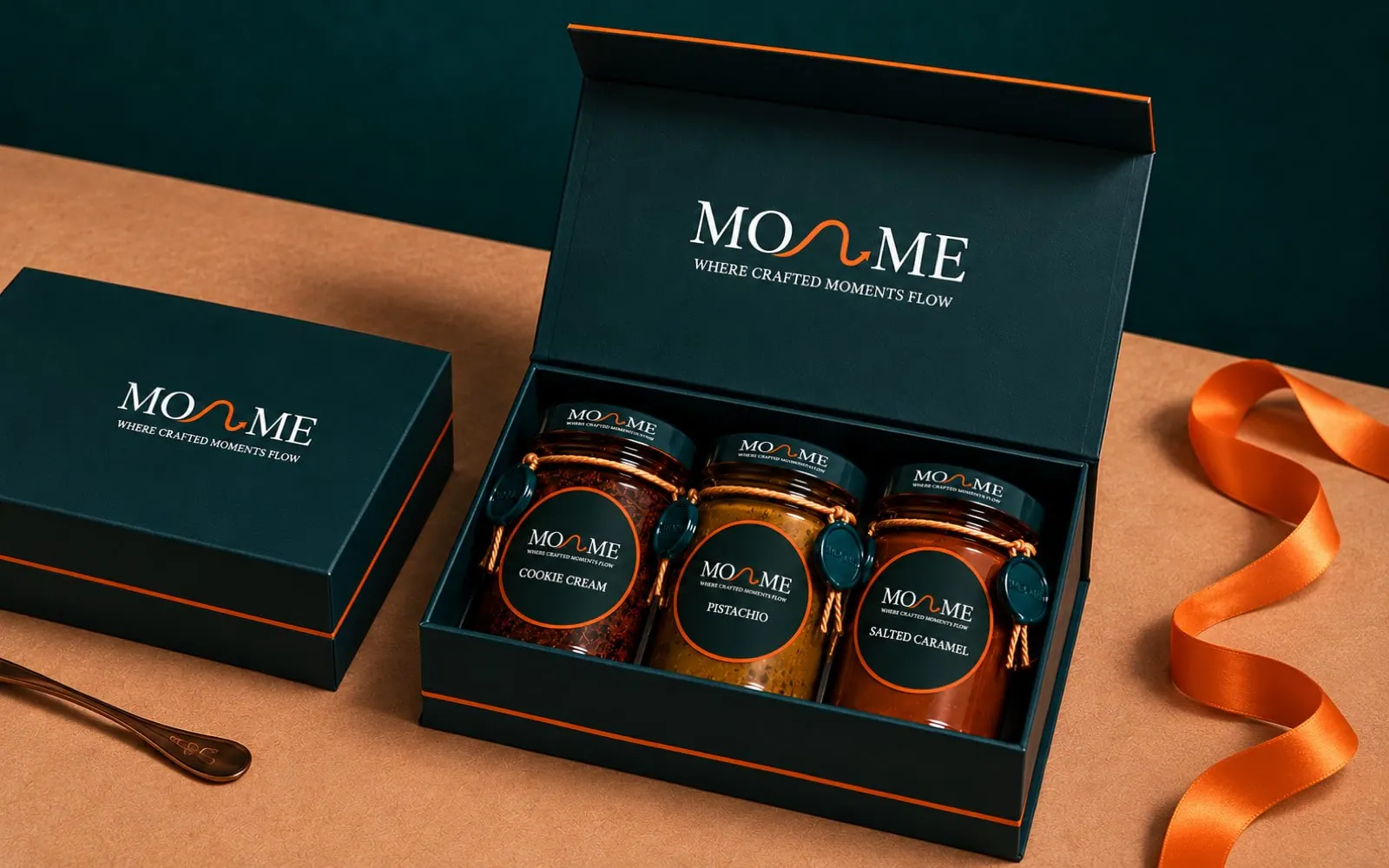
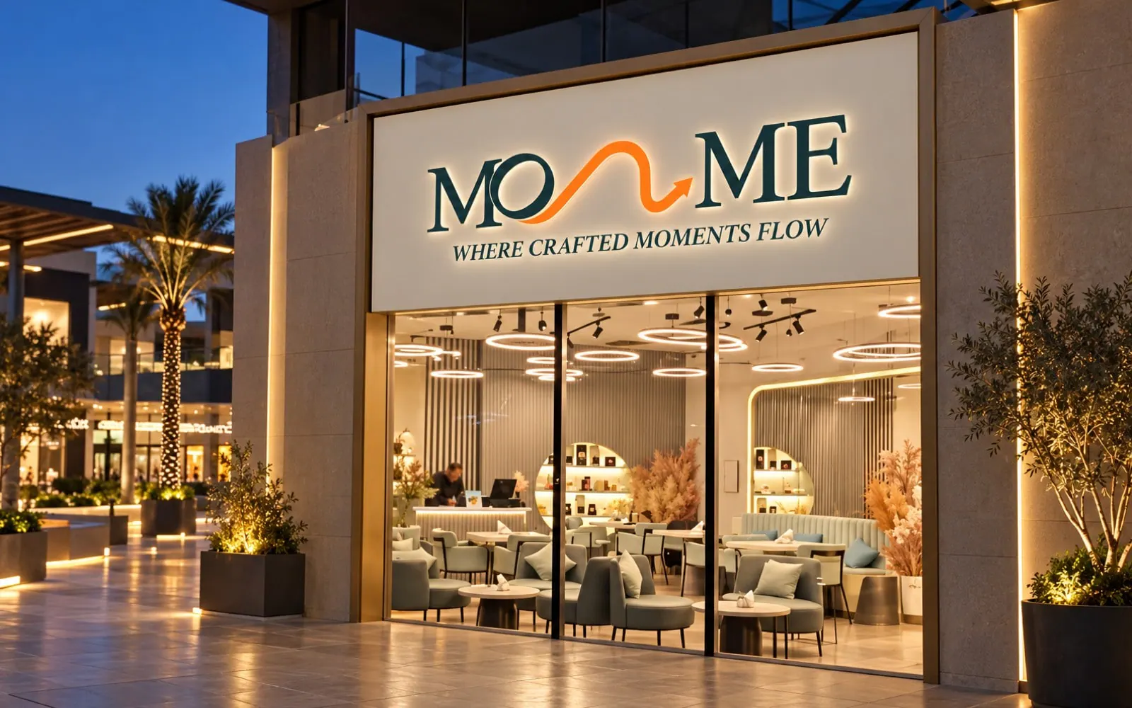
The identity applied across the café: the front, the counter, the display, the menu and the team's aprons.
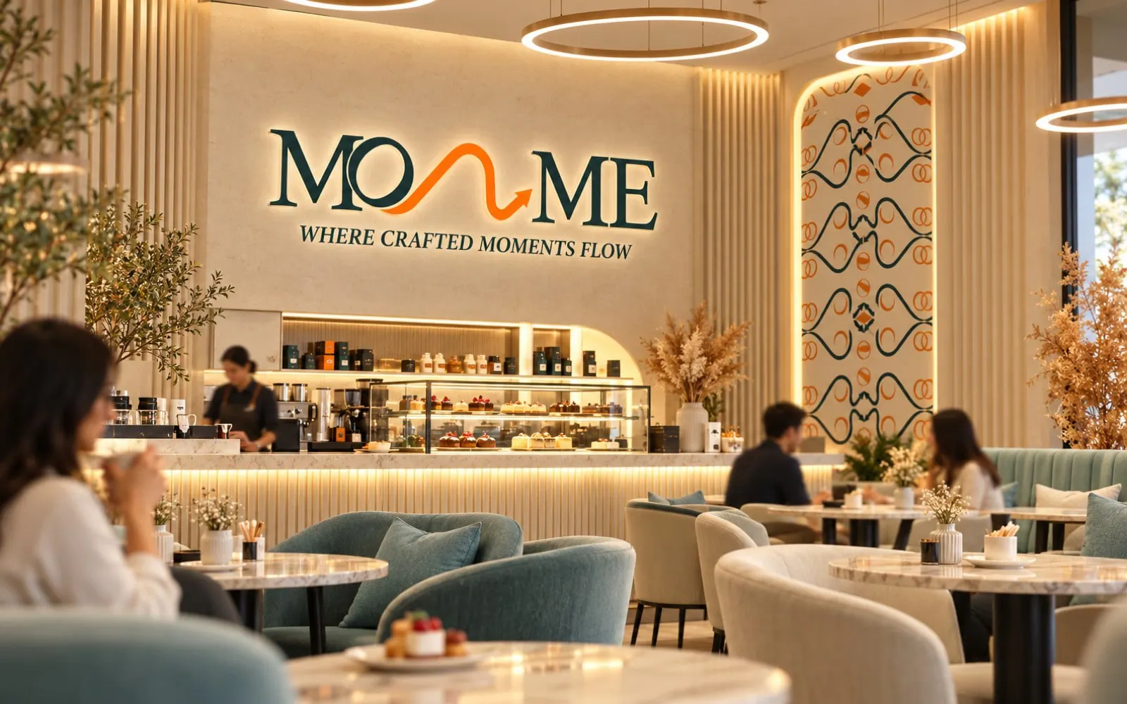
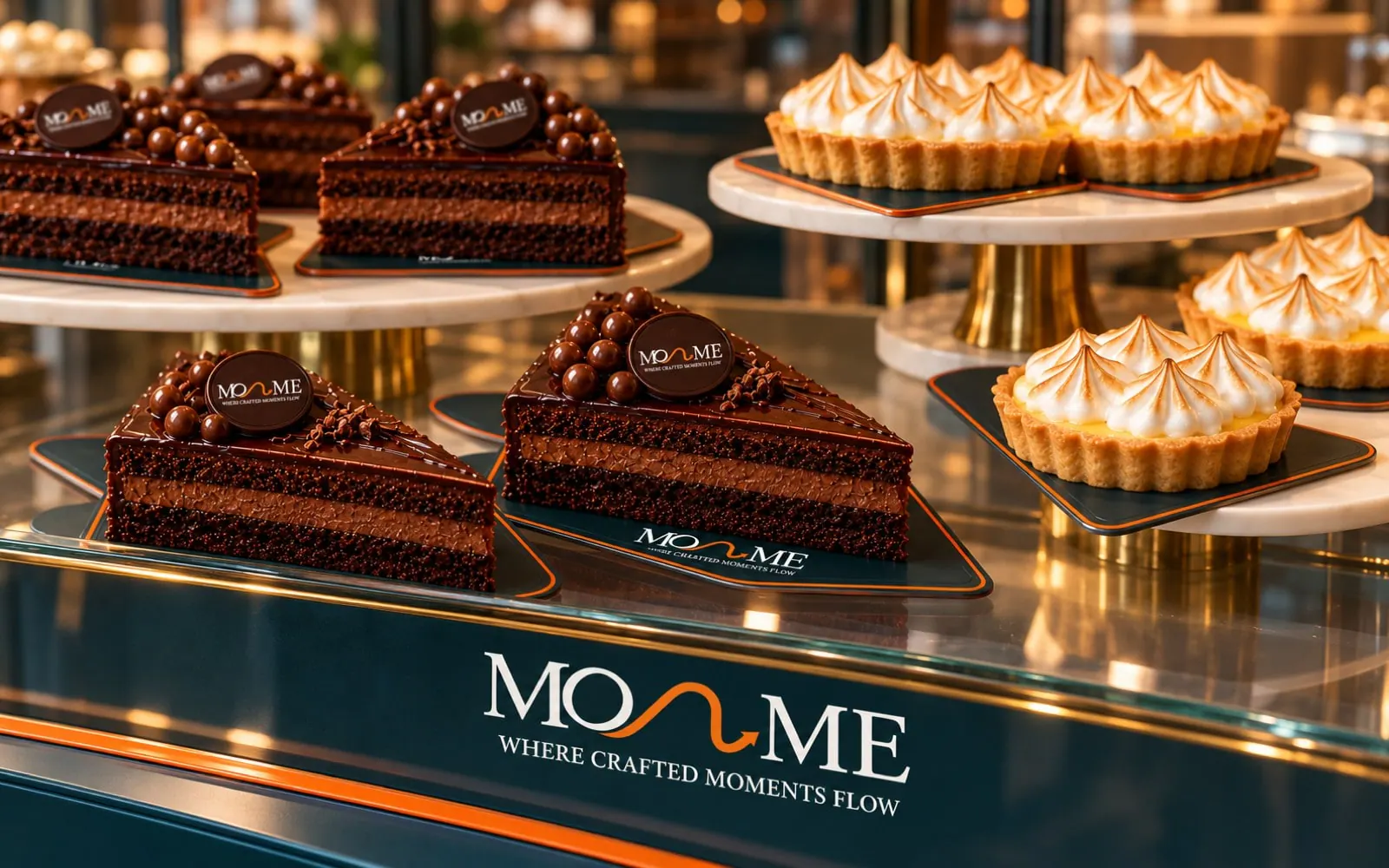
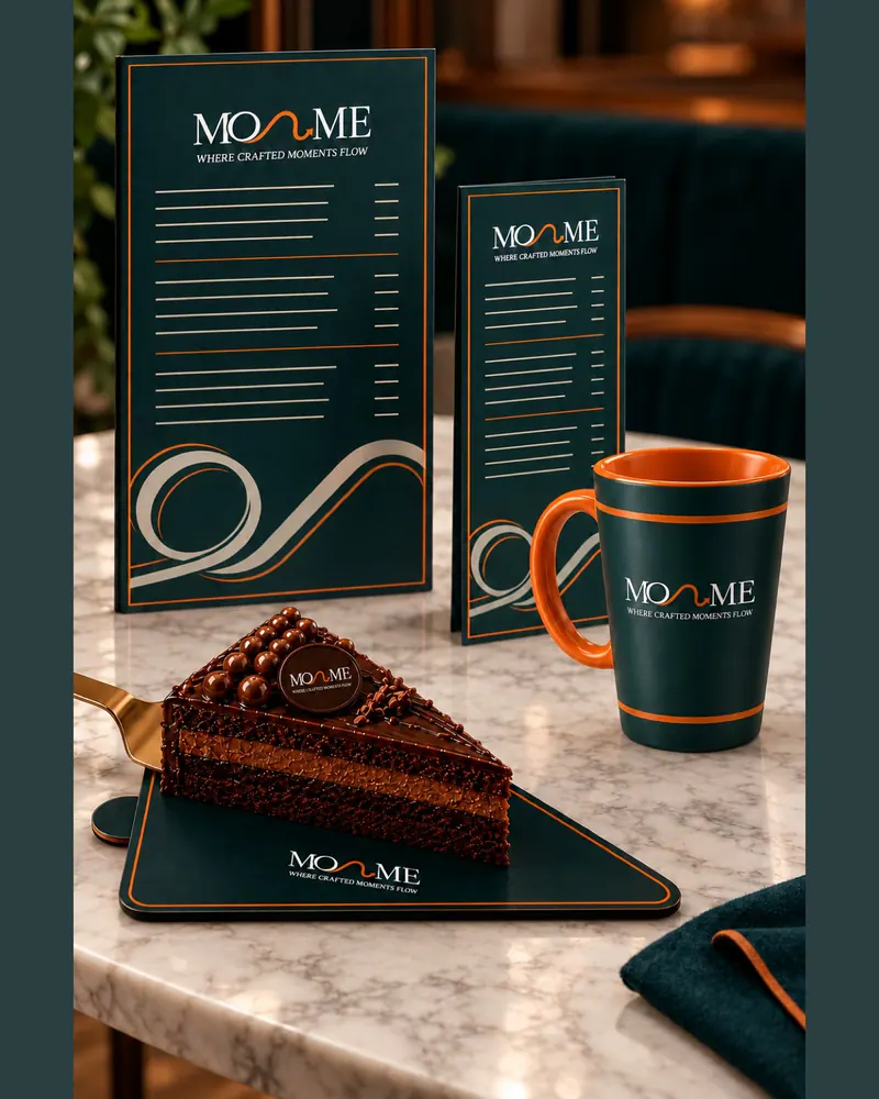
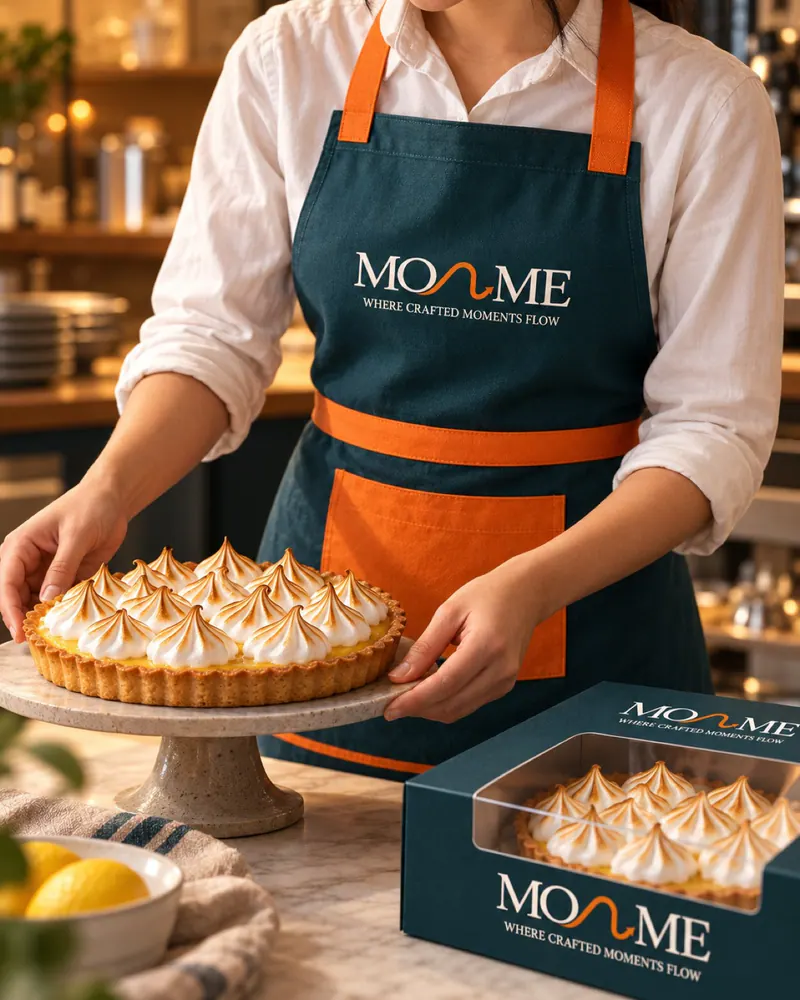
Warm light, the dessert first and the brand always in the frame. The same direction carries into social posts and stories.
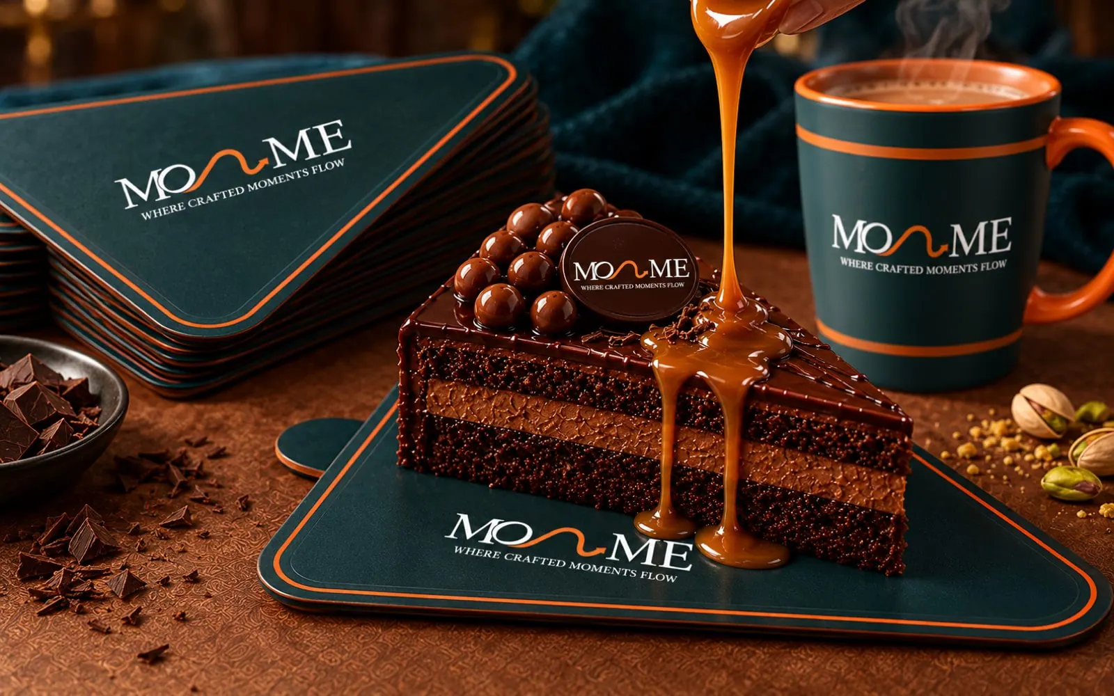

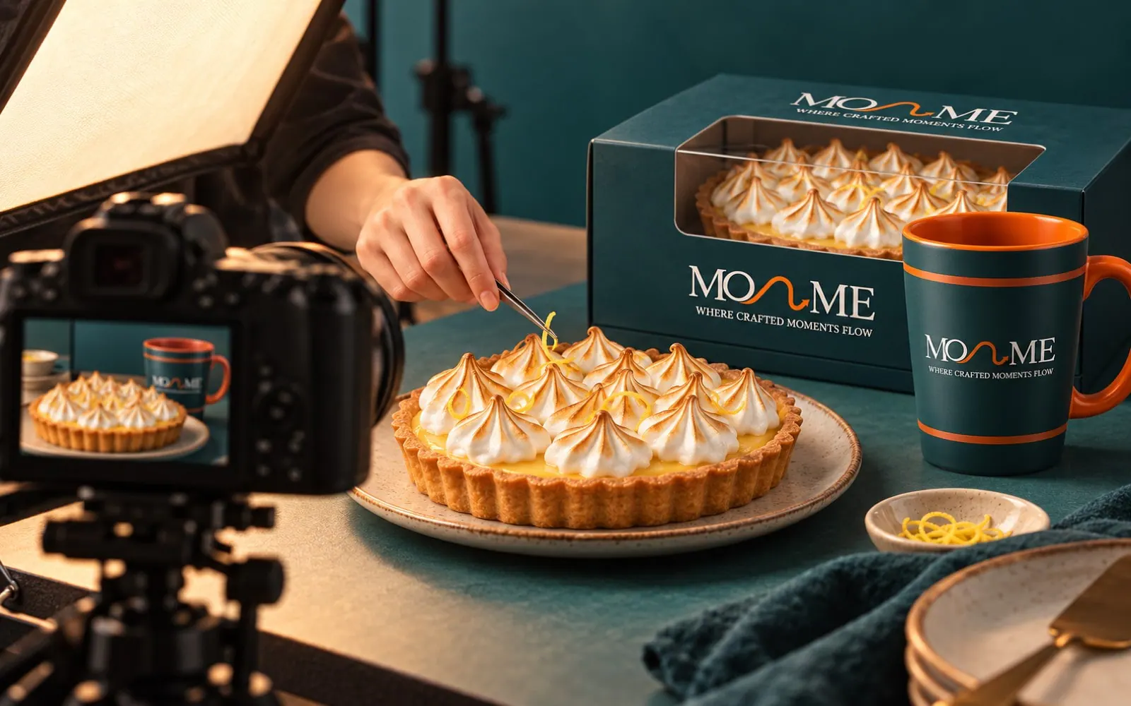
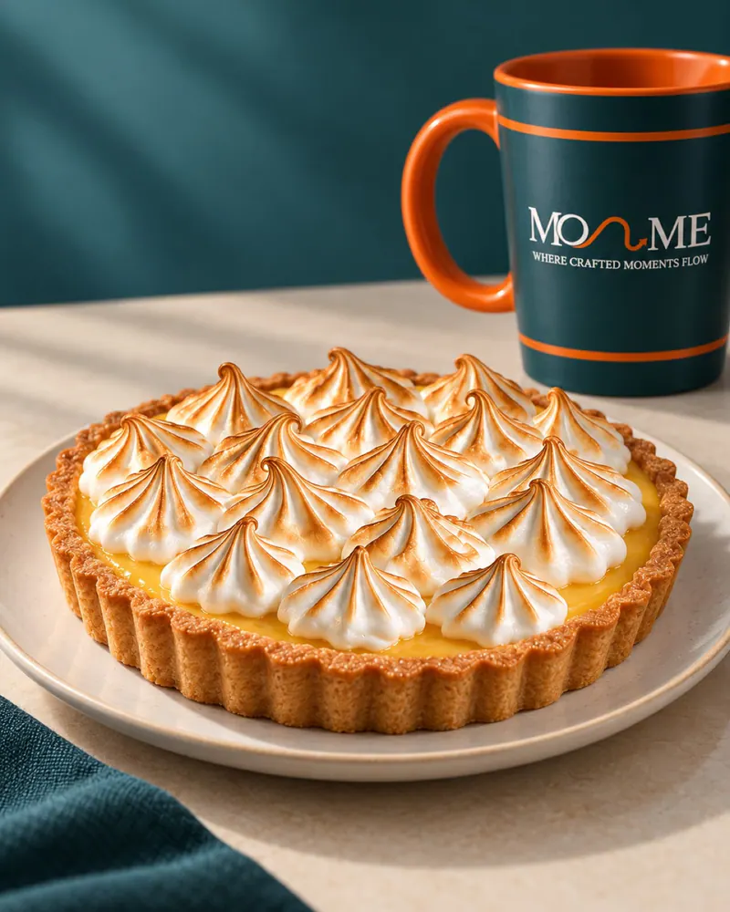
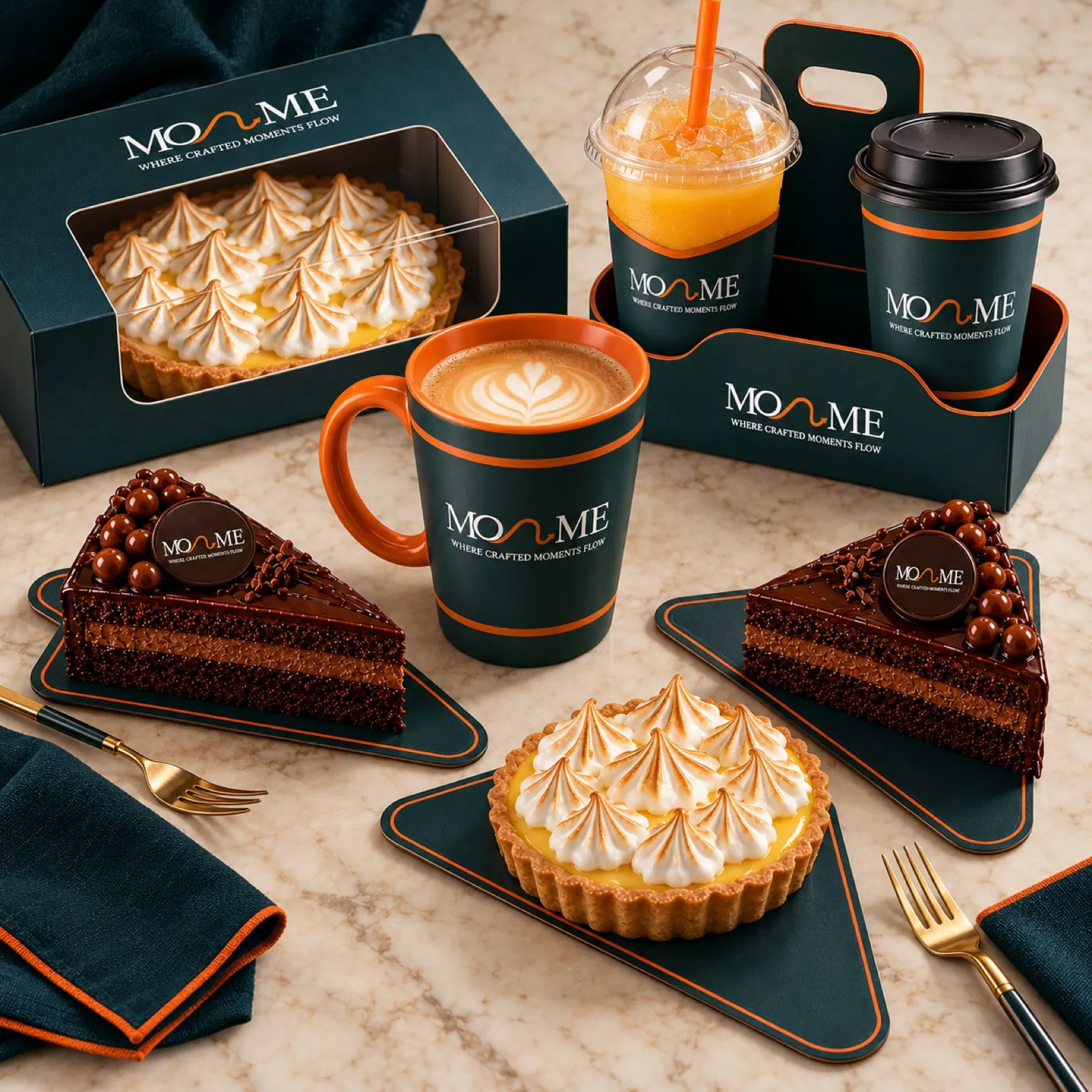
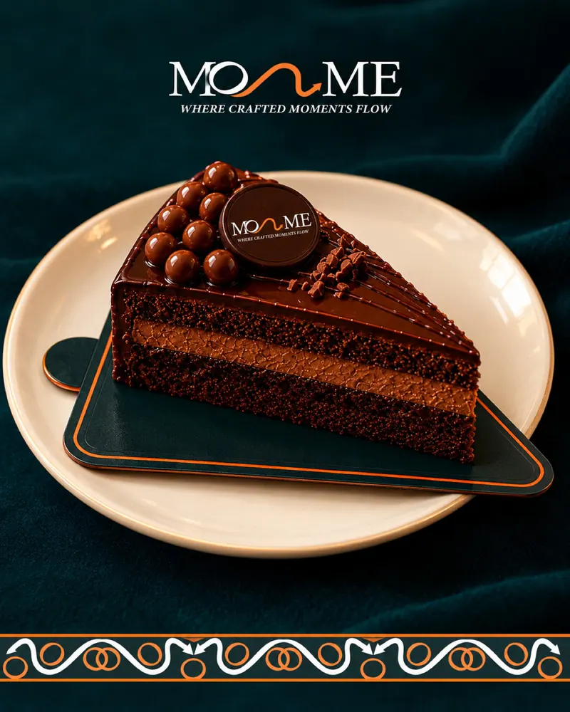
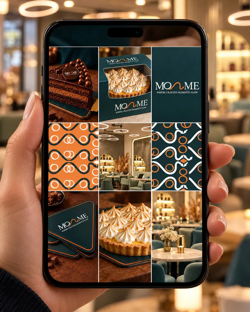
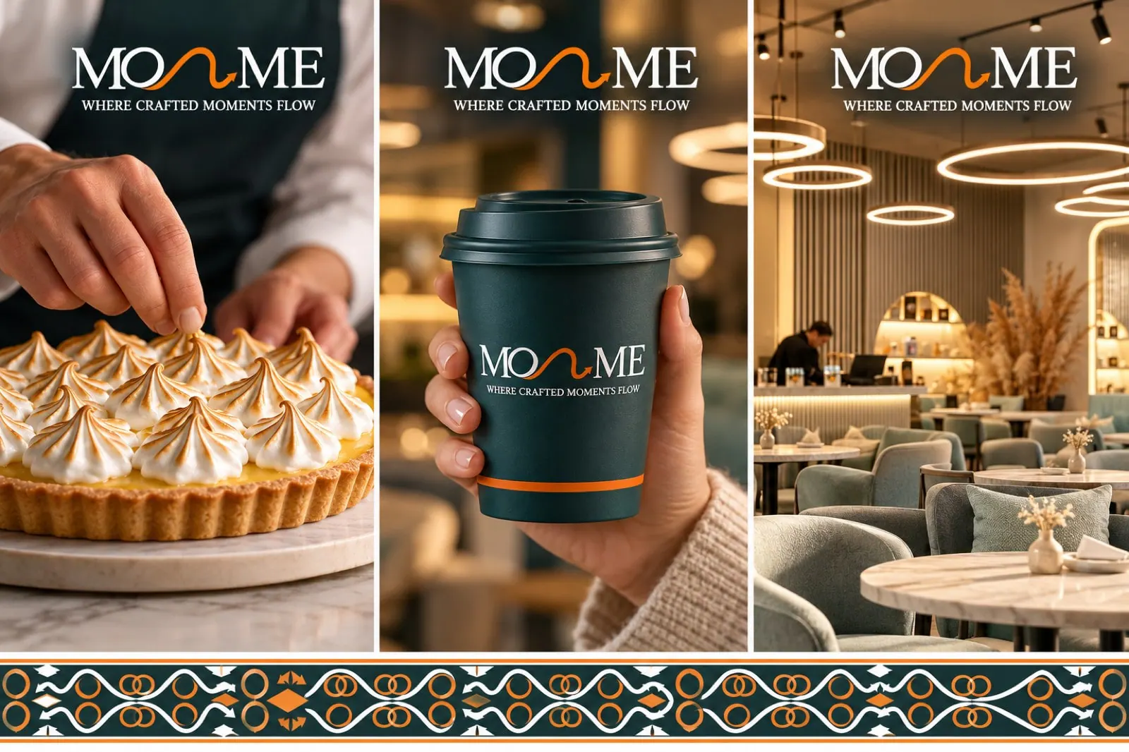
A marketing plan built on the new position, and a brand ready to open new branches without losing its look.

Tell us what the business needs to understand, decide or change. We will review the context before recommending the next step.