
A new business identity: what to build on day one, and what can wait
Read the article
A rehabilitation centre for children with special needs: research, logo, identity, brand guidelines and print, from stationery and uniforms to signage and outdoor.
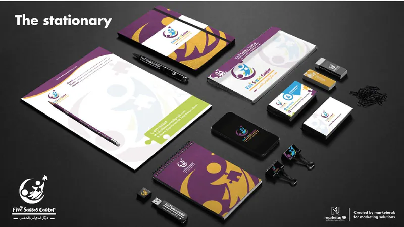
Five Senses Center works with children with special needs and their families. A centre like this is chosen on trust: parents need to feel warmth and seriousness at once, from the first sign on the street to the card in their hand. The centre needed one identity that carries both, in Arabic and English.
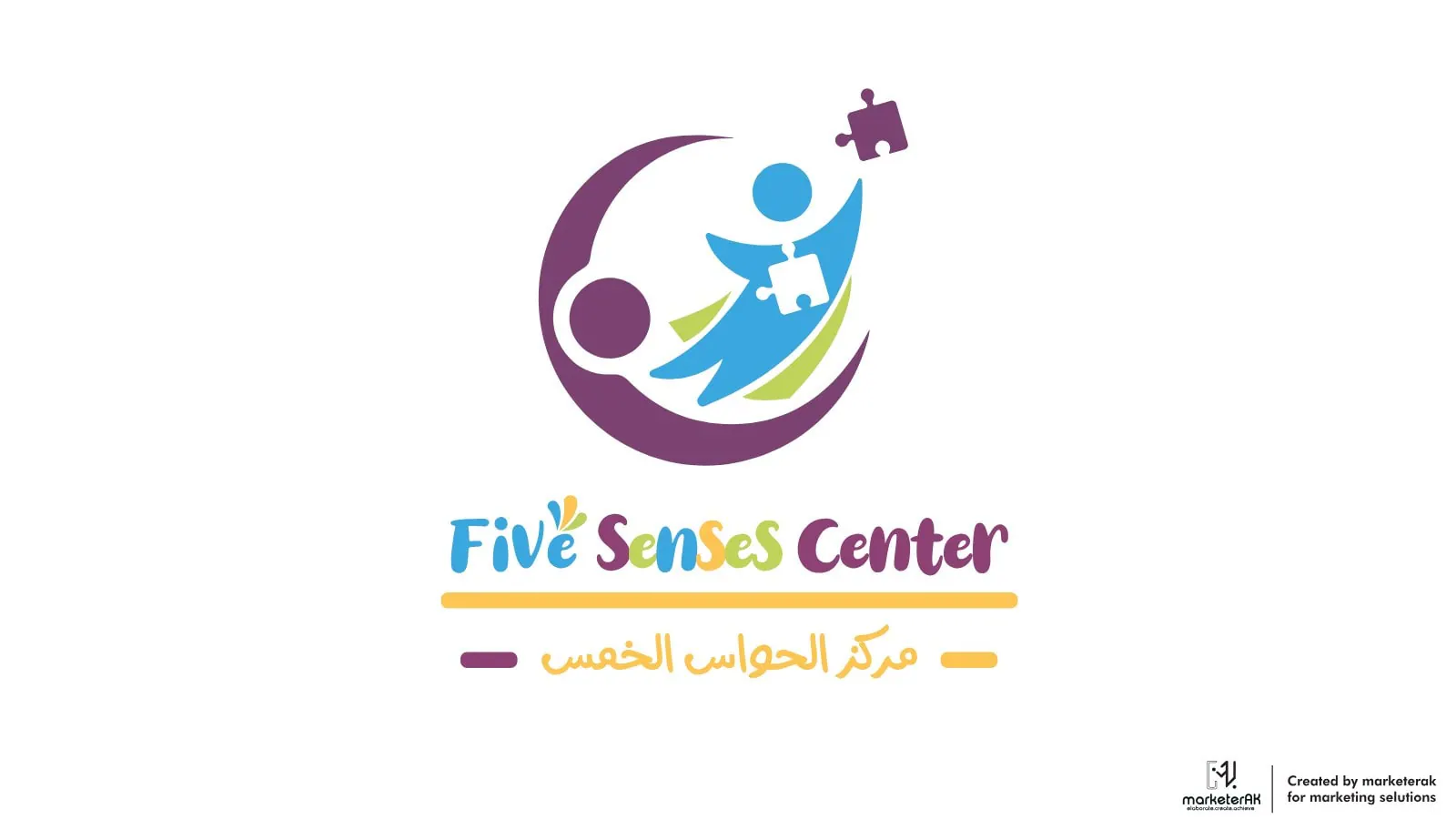
We started with research, then designed the logo: a child reaching up, a puzzle piece and a circle that holds them. Around it we built the colours, Arabic and English type and a guidelines book, and designed and produced the print: stationery, uniforms, office items, cups, the entrance sign and the outdoor line «They are capable».
Before the logo, we looked at who the centre serves and who chooses it: the children, and the parents who decide where to bring them.
A child reaching up, a puzzle piece and a circle that holds them, with the name in Arabic and English.
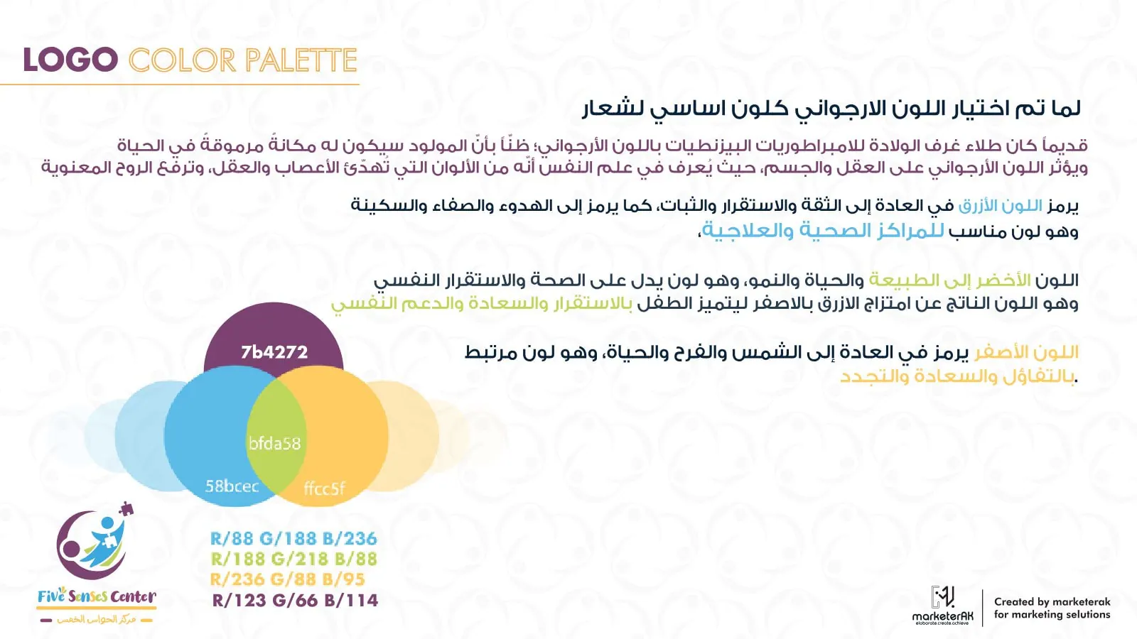
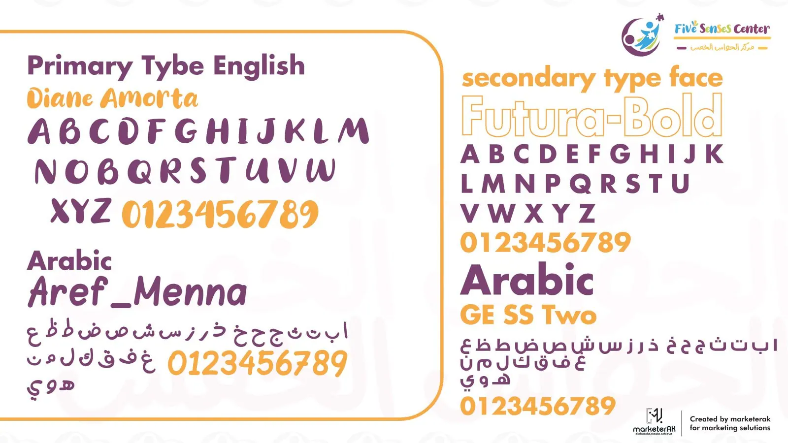
Purple leads, with blue, green and yellow taken from the logo. The guidelines set the colours and the Arabic and English type, and explain why each colour was chosen.
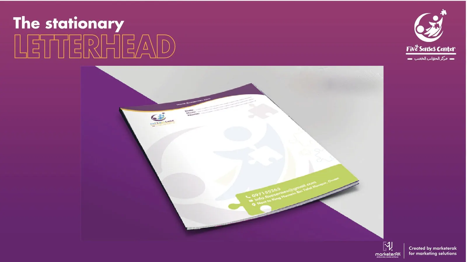
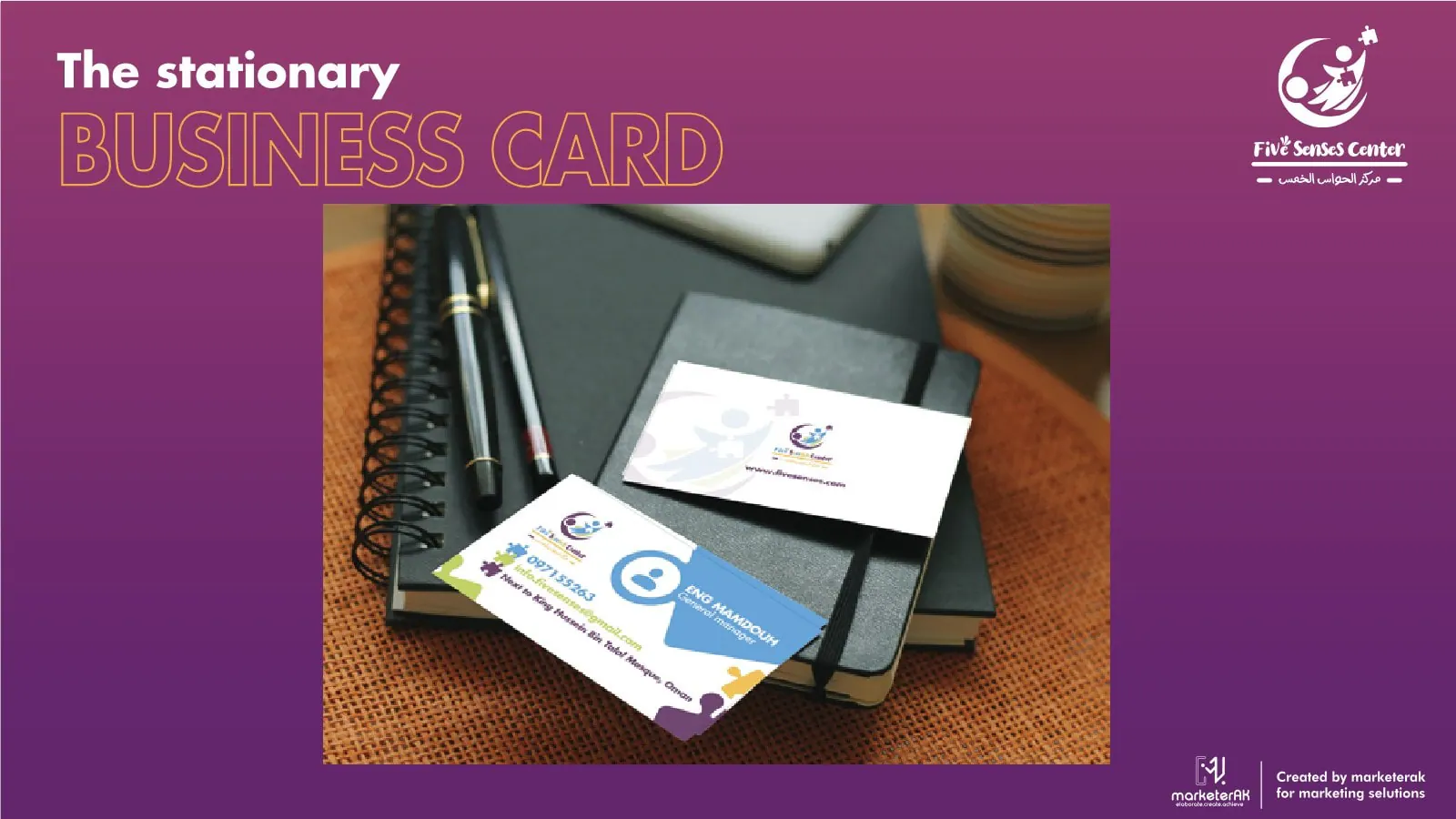
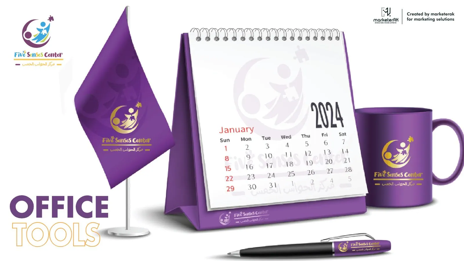
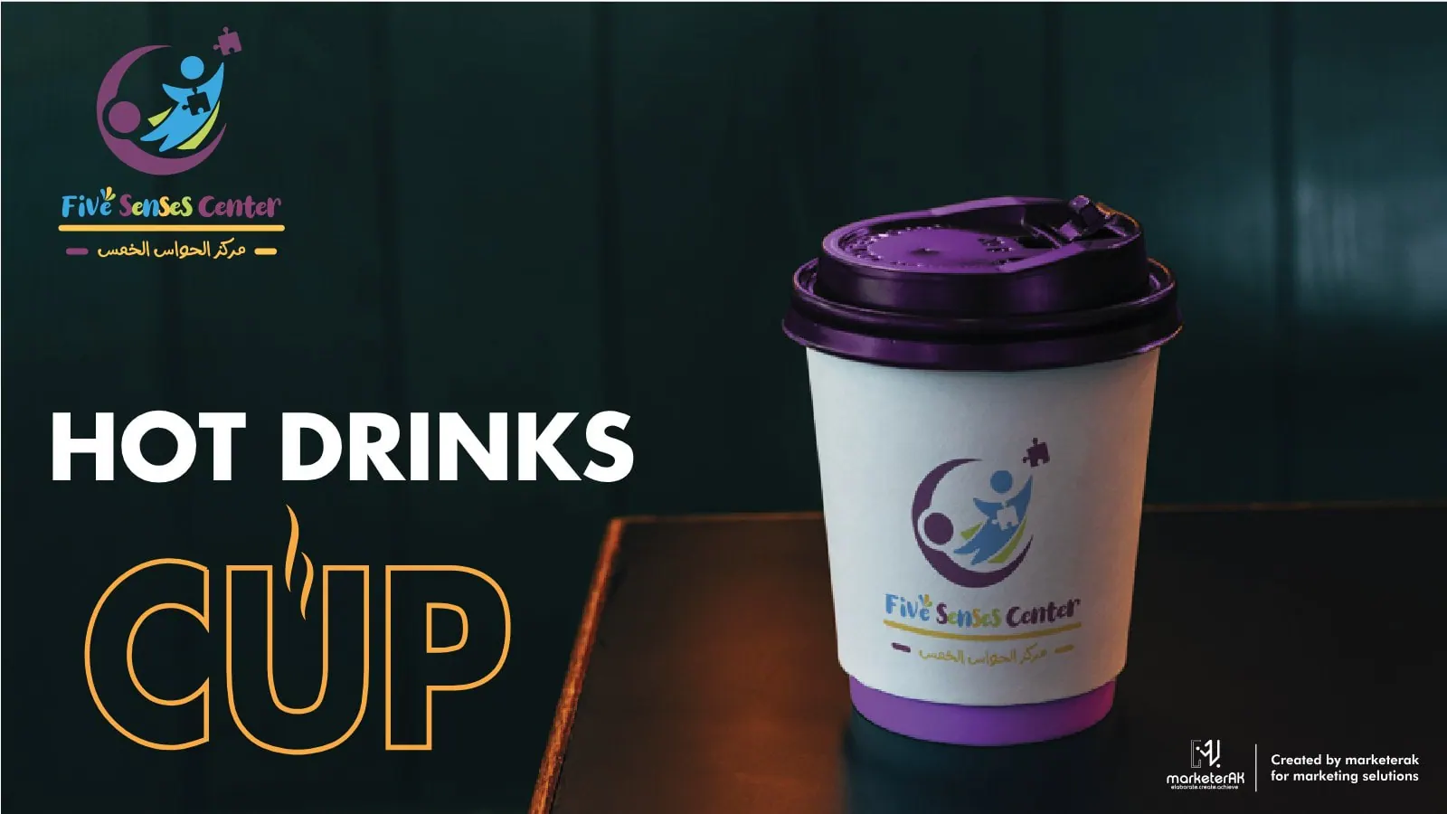
Letterhead, business cards, office items and cups, designed and produced in the centre's colours.
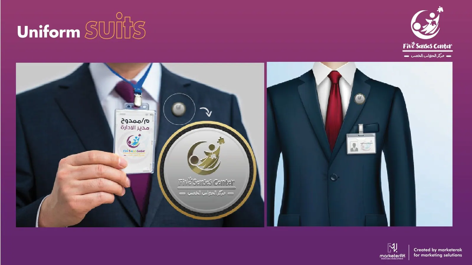
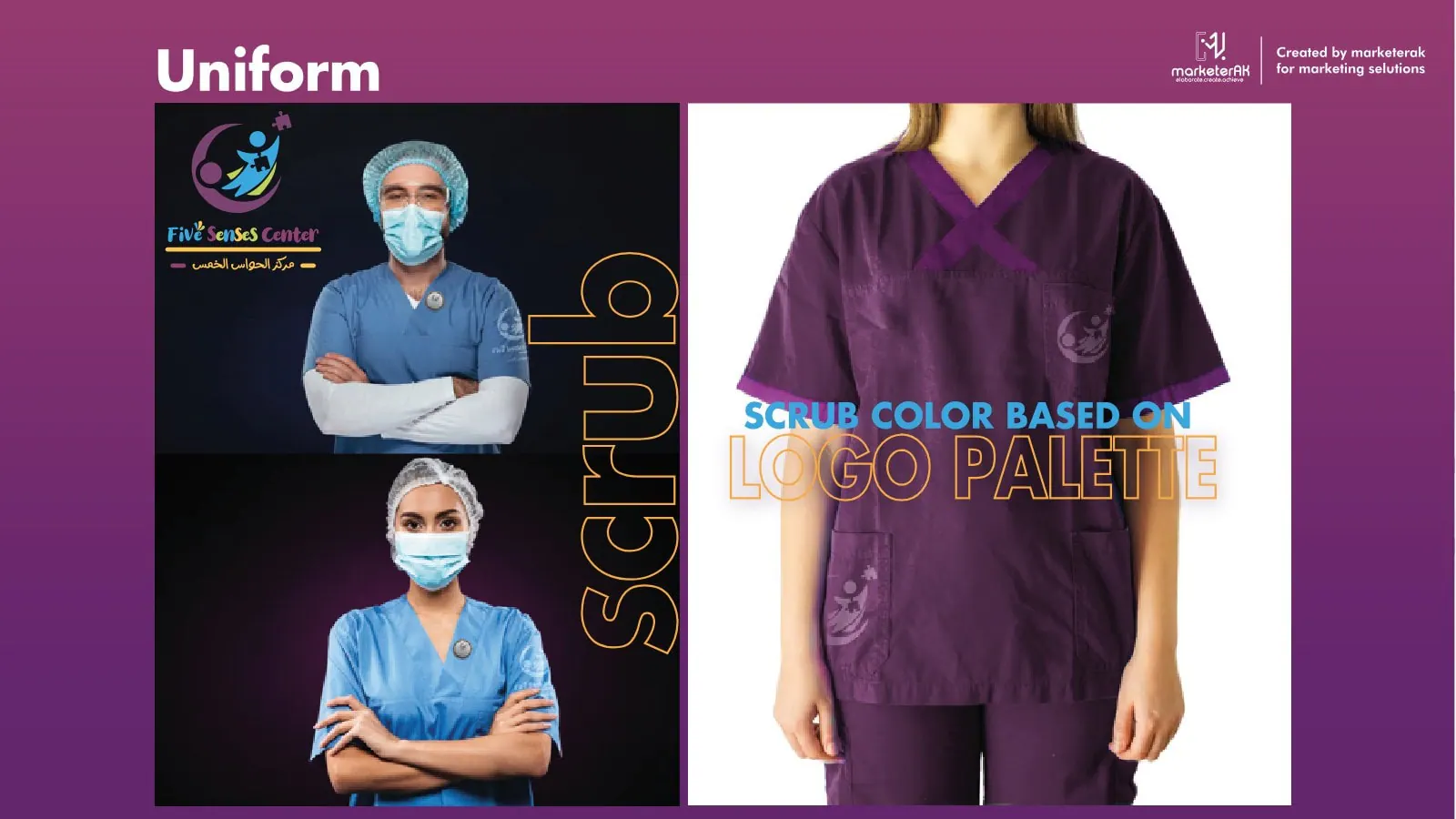
Staff suits and badges, therapist scrubs in the logo palette, and the entrance sign.

One line for outdoor and station posters: «They are capable». It speaks about the children, not the centre.


I’ve worked with OG on a restaurant, a gym, a children’s rehabilitation center, and dental and cosmetic clinics. Four businesses with nothing in common, and every time they started from zero to understand that place’s customer. I don’t recommend people easily, but I’ve recommended OG to more than one business owner, and every one of them thanked me.
Tell us what the business needs to understand, decide or change. We will review the context before recommending the next step.