
A new business identity: what to build on day one, and what can wait
Read the article
We built Rokaya Jaheen's identity around a needle passing through her name, then carried it into labels, packaging, photography, social media and campaigns, so every piece reaches its audience with one calm, refined character.
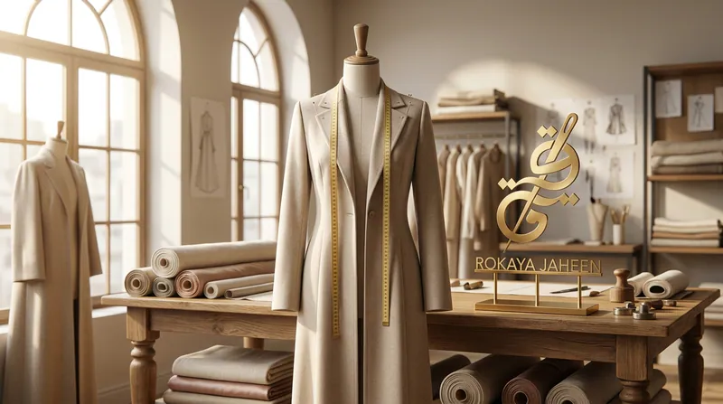
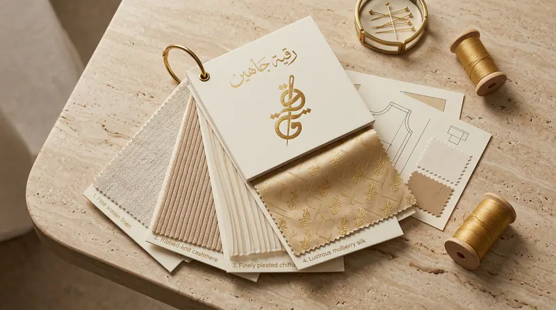
The work started by defining the brand's look: contemporary modest fashion joined with careful hand tailoring. The moodboard brought together cashmere and linen, pleated chiffon, pattern drawings and calm pastel tones around the gold mark.
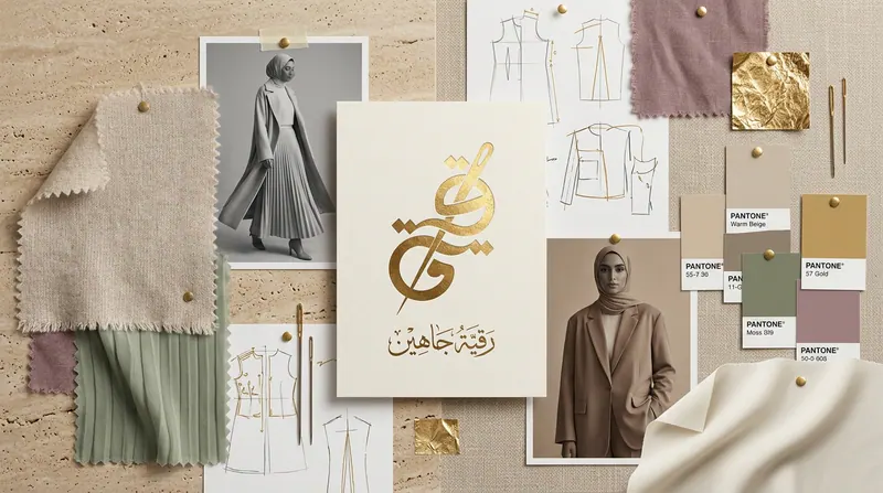
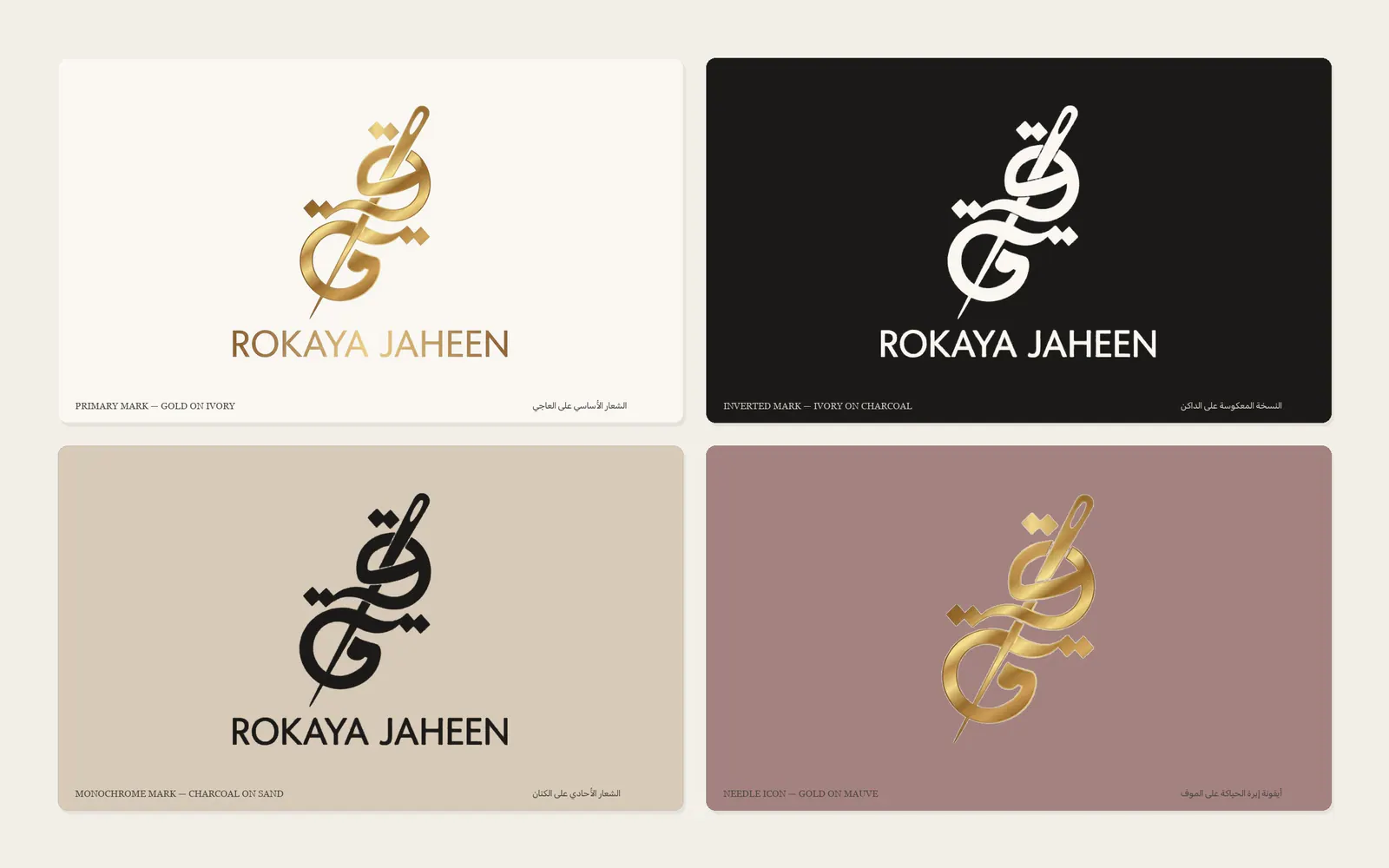
The mark writes «Rokaya» in Arabic calligraphy with a gold sewing needle passing through the letters, so the craft and the designer's name become one sign. The construction drawing fixes its angles and proportions, so it keeps its balance from a woven label to a shop sign.
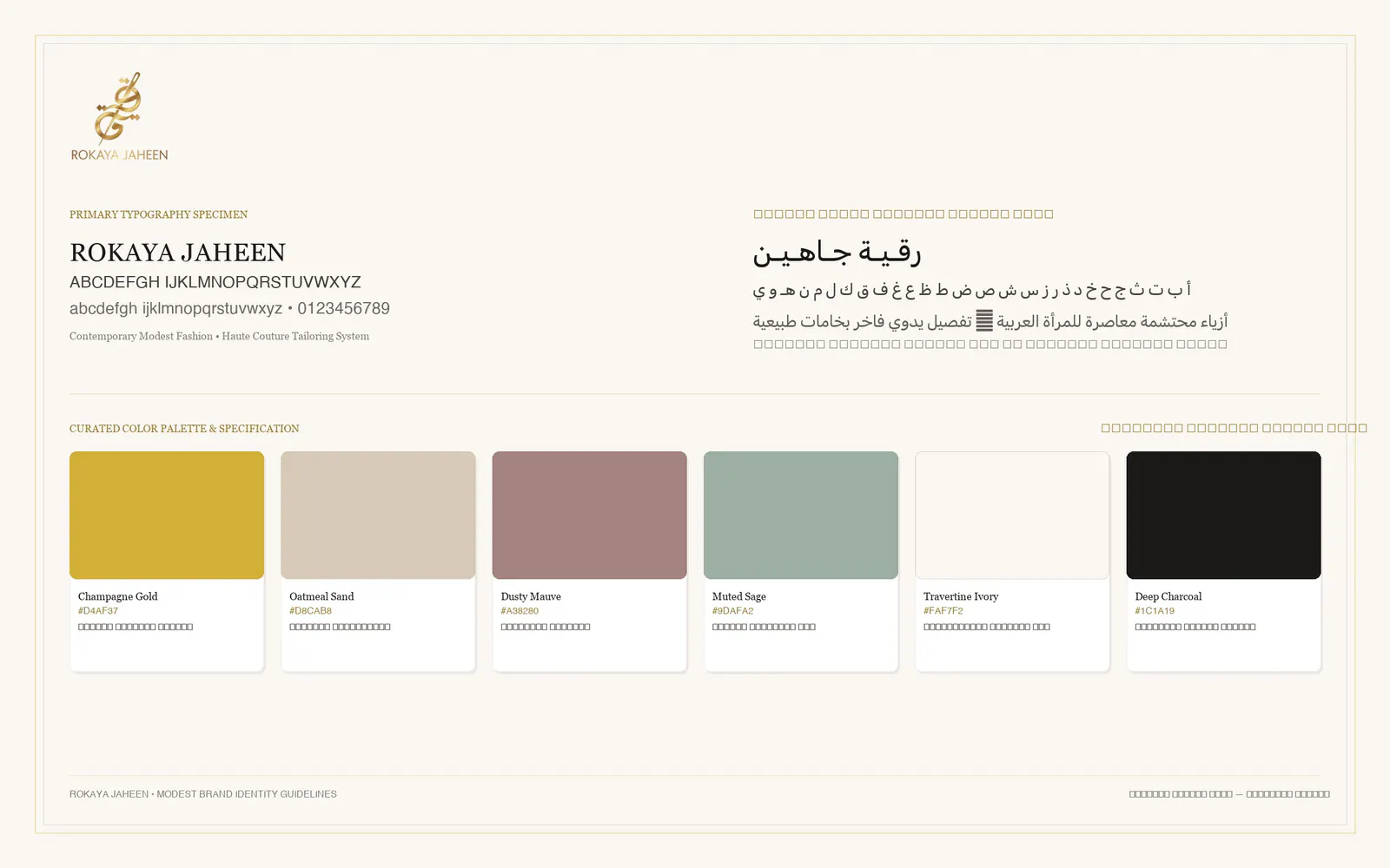
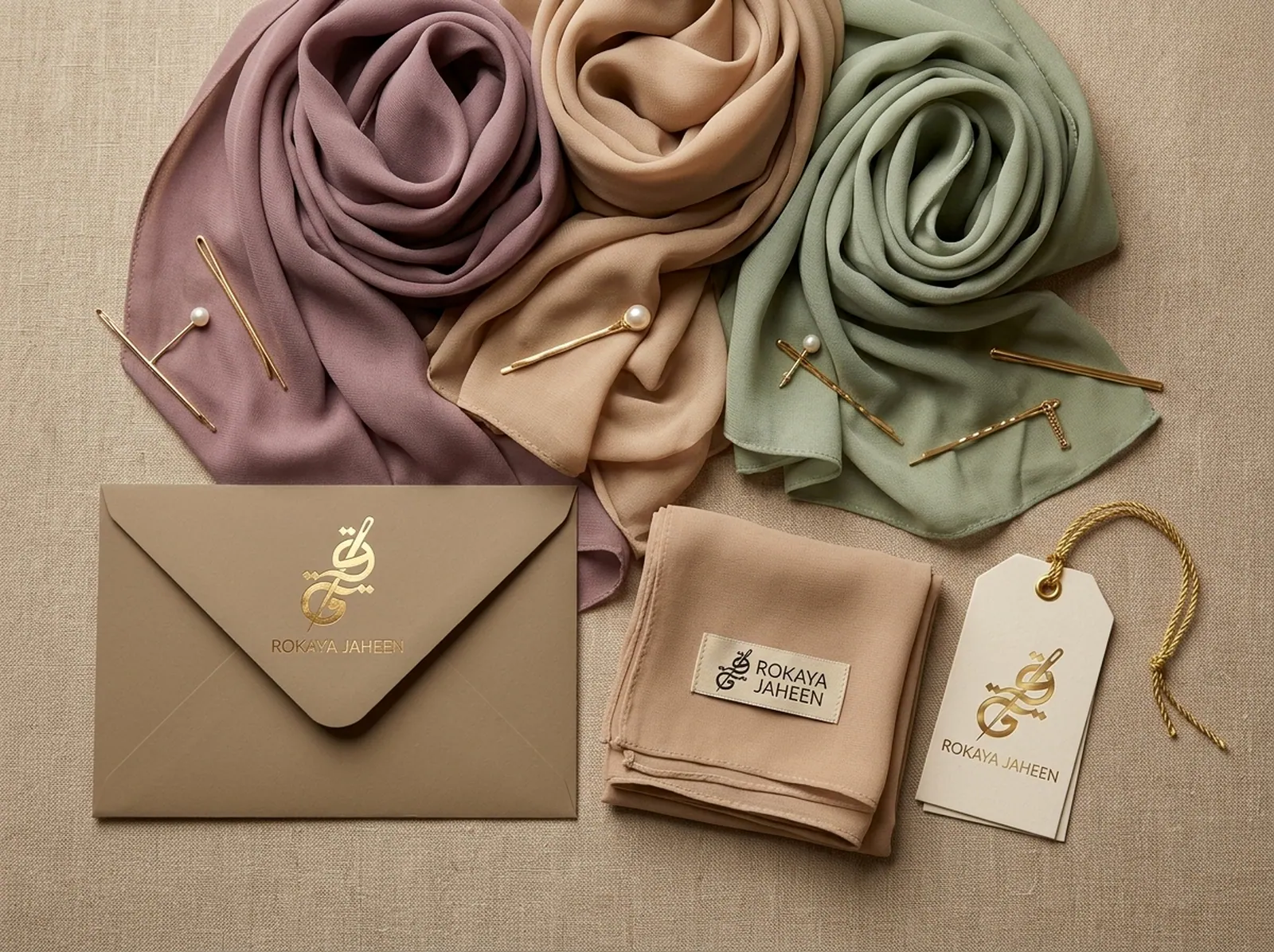
The mark sits on four grounds: ivory, charcoal, sand and mauve. Beside it, an Arabic and Latin type pairing and a palette of six tones taken from natural fabrics, with gold kept for the mark and its details.
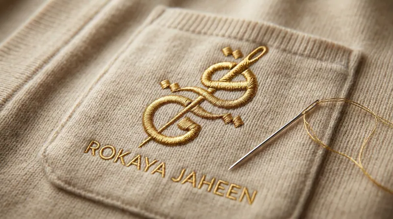
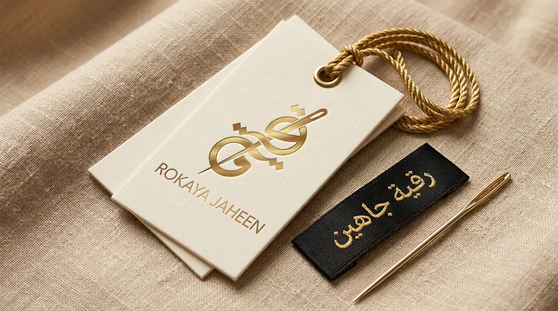
From there the mark turns into the brand's details: a gold-thread monogram on a cardigan pocket, a repeat pattern for scarves and linings, and cotton hang tags with a gold cord beside a woven neck label.



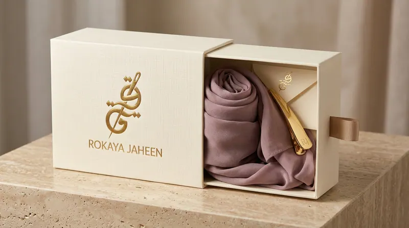
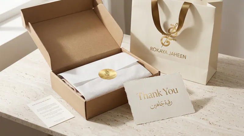
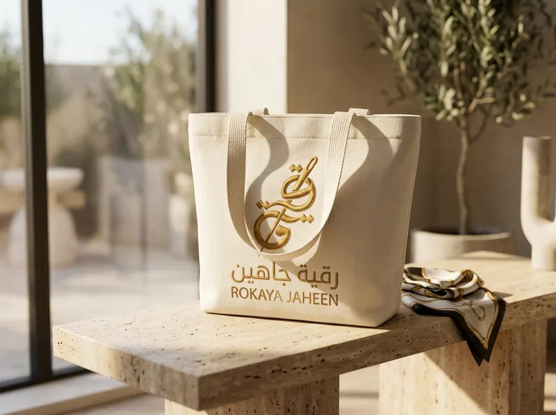
The packaging system covers a drawer box for scarves with a gold clip, a shipping box with tissue, a gold seal sticker and a thank-you card signed by the designer, a rigid gift box with a shopping bag, and an embroidered canvas tote.
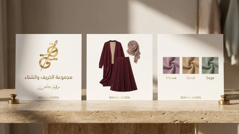
The same care reaches the smaller pieces: an embroidered canvas tote, and silk scarves in mauve, sand and sage that ship with a care card and their own envelope.

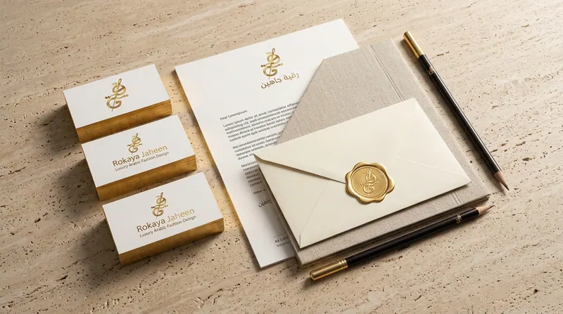
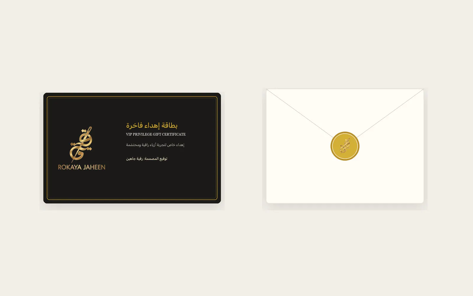
Business cards, letterhead and an envelope sealed with gold wax, plus a gift card for loyal customers in charcoal and gold.
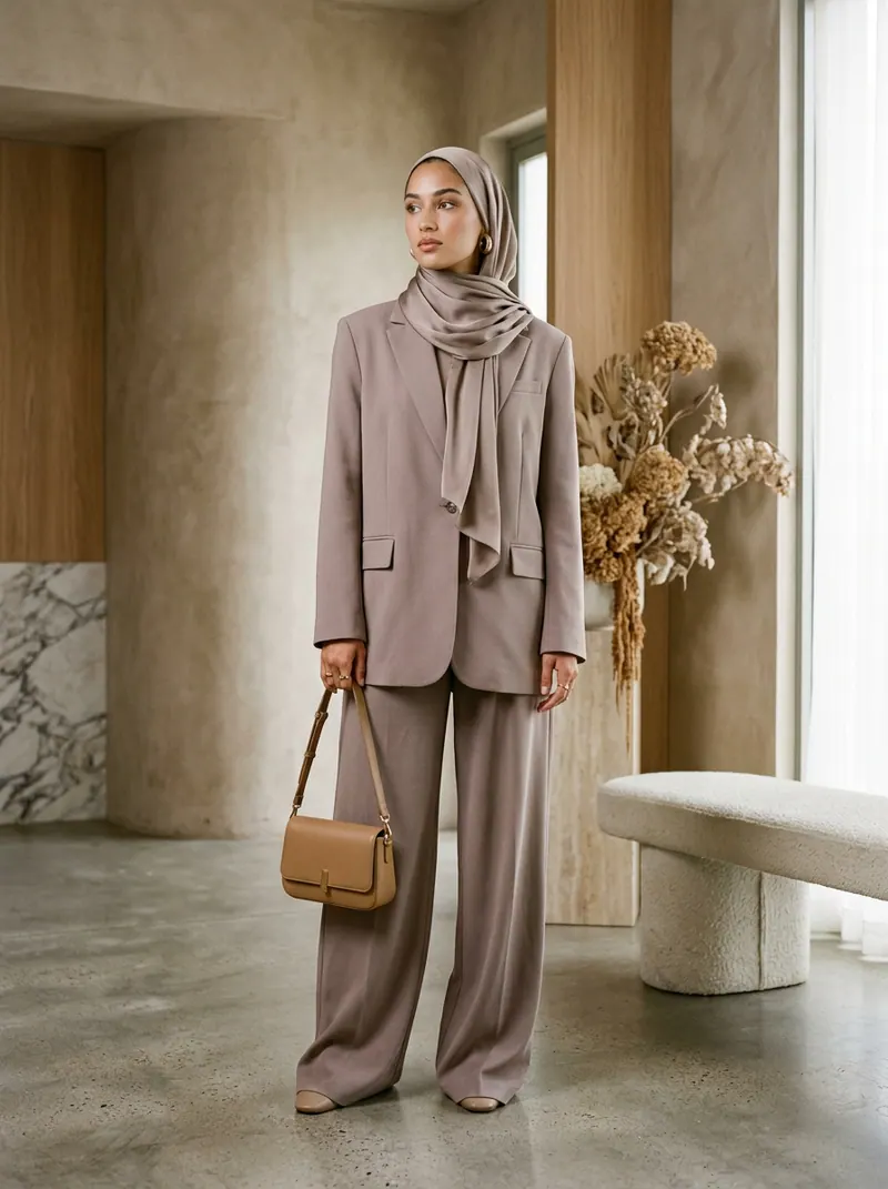
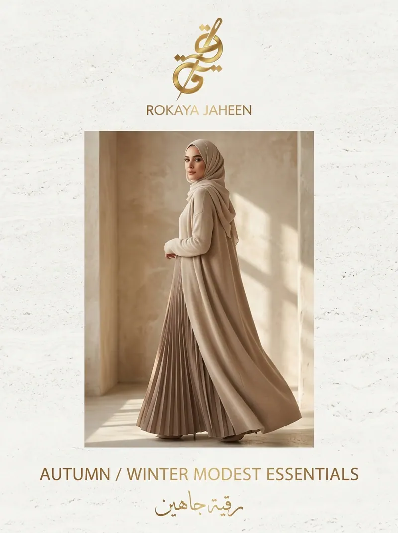
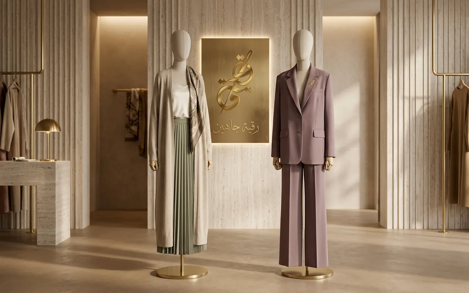
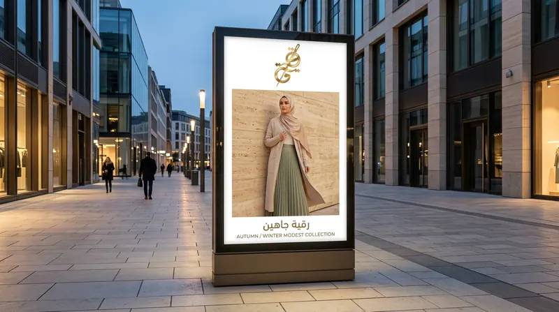
The photography shows the collection as complete looks in calm stone settings: a pleated maxi skirt with a long cardigan, an easy oversized blazer with wide trousers, and the autumn and winter launch poster.
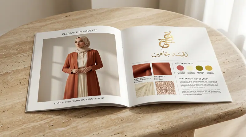
Around the looks sit the showroom styling, an open lookbook with fabric and colour notes, and a fabric swatch ring.

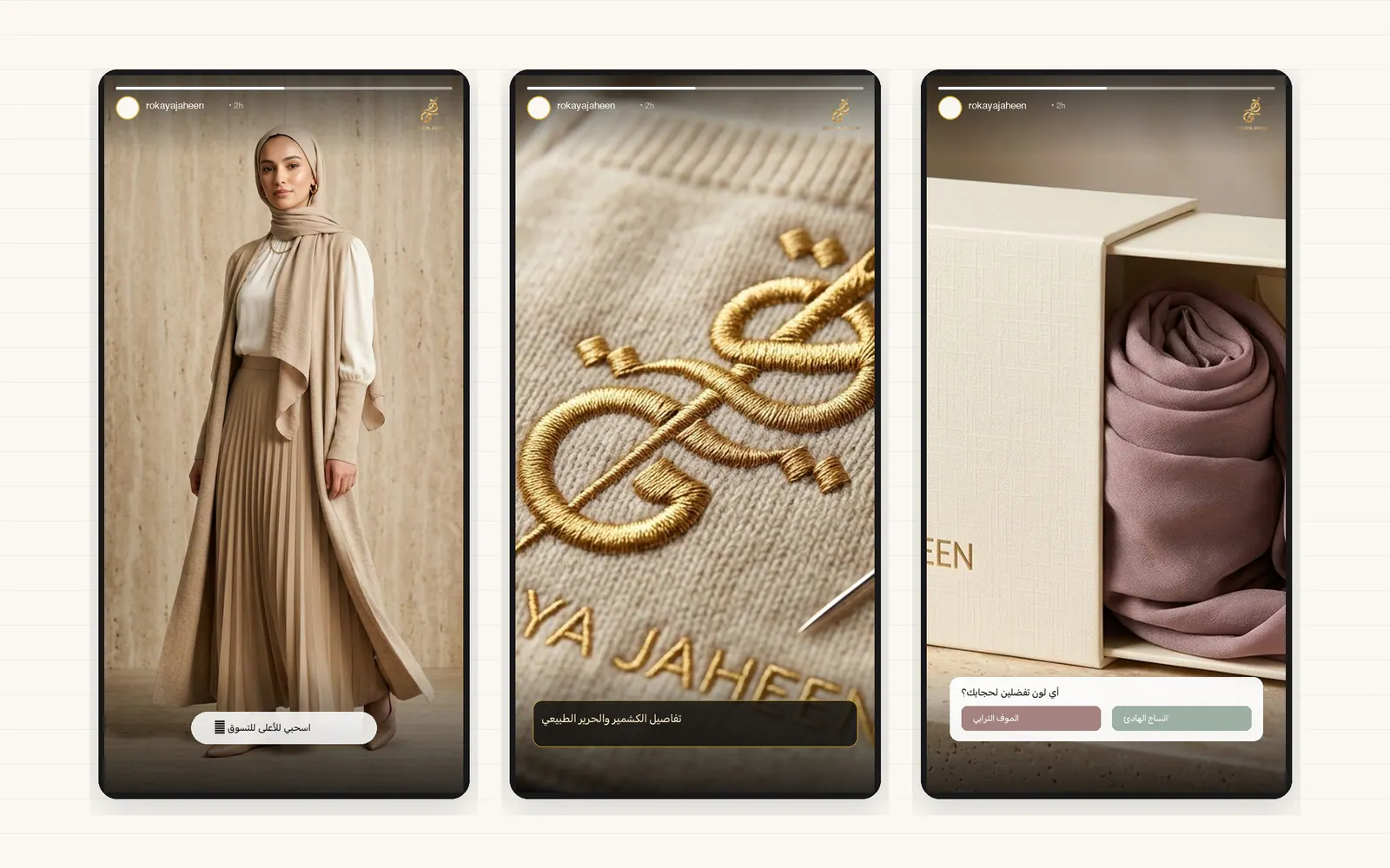
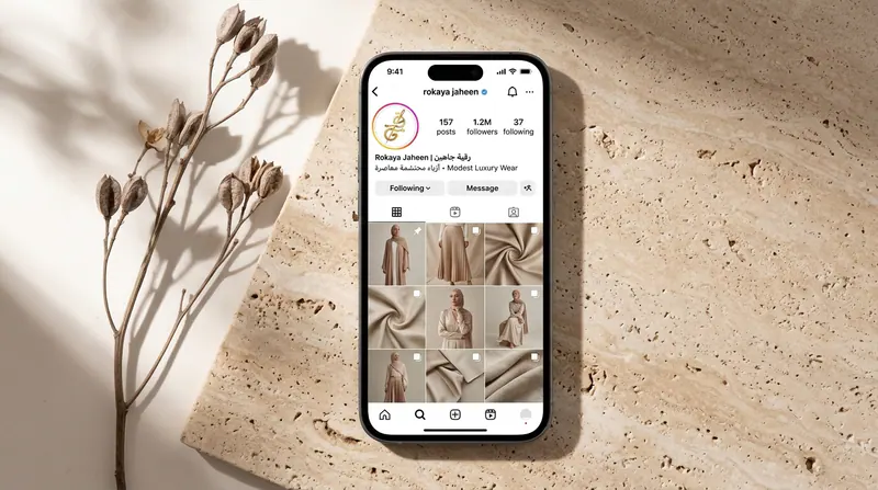
Social media ran from research and a plan to content, design, management and campaigns. Stories, posts and the Instagram grid carry the collection, the styling and the packaging in the same gold and calm tones.
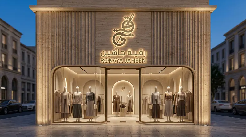
The identity was tested at full scale: a storefront with an illuminated gold sign and a city-light poster for the collection.
Tell us what the business needs to understand, decide or change. We will review the context before recommending the next step.