Case study · Natural Coloured Contact Lenses

O.O Lens | A Natural-Look Lens Brand from Name to Shelf

We built O.O Lens as one brand system for natural-look coloured contact lenses, from research, the name and the logo idea to packaging, photography, social media, campaigns, retail and a website for the UAE market.
Sector
Natural Coloured Contact Lenses
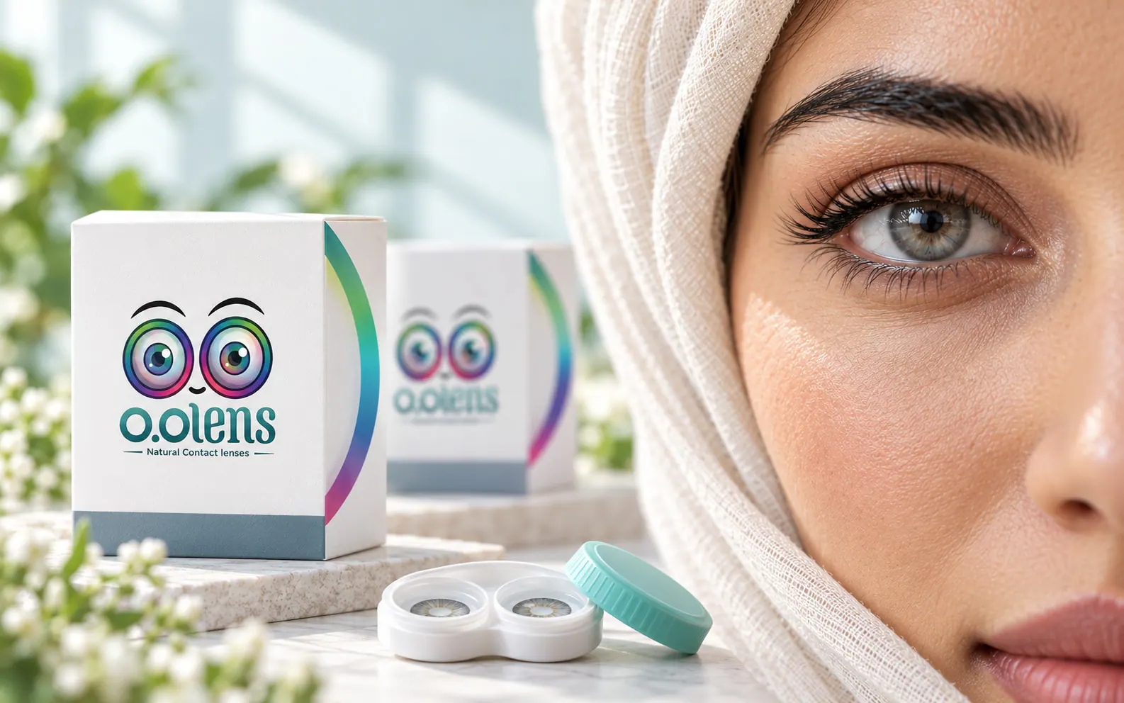
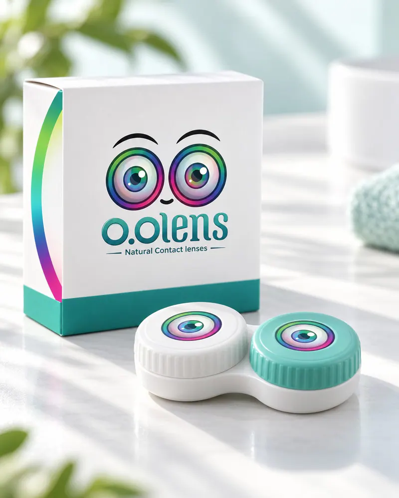
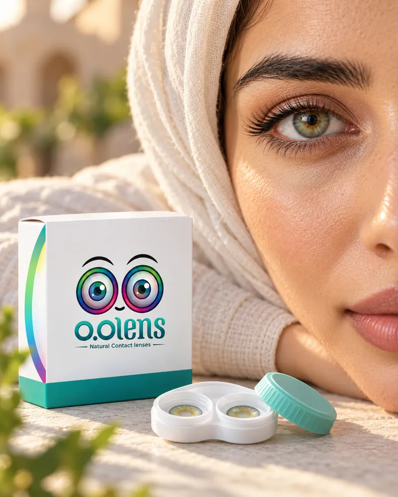
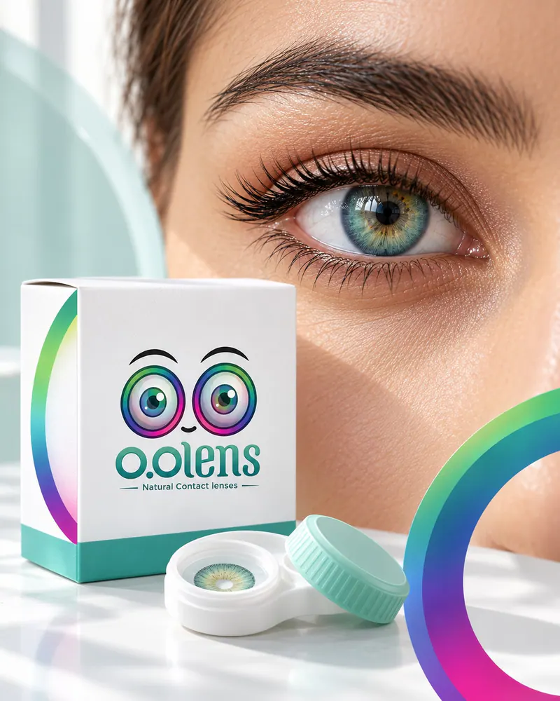
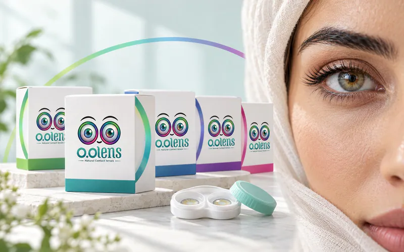
O.O Lens key visual: shade boxes, a lens case and a close-up of an eye wearing a natural shade
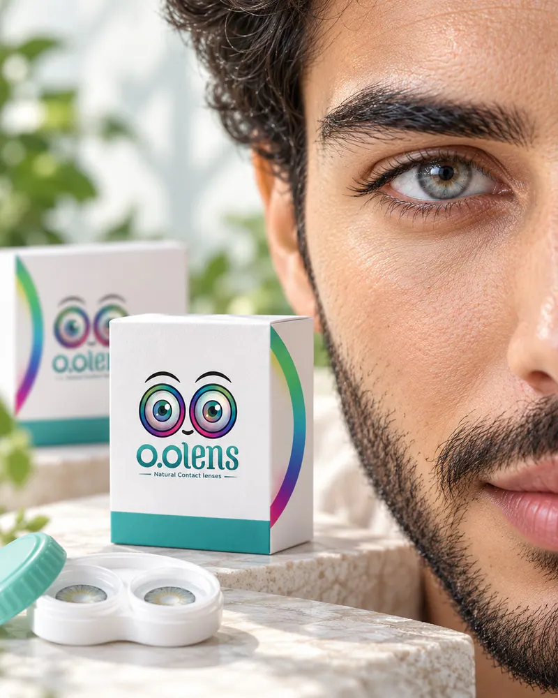
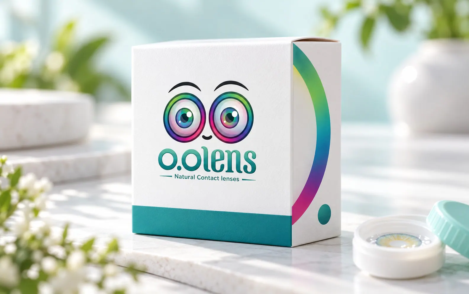
Close view of an O.O Lens box with the iris-ring gradient on its edge Close-up of an eye wearing a natural O.O Lens shade in daylight
01

A coloured-lens brand that has to look natural

The work started with research and analysis of the category and its audience, before any design. O.O Lens sells coloured contact lenses with a natural look. The brand had to show each shade honestly, stay friendly and feel trustworthy wherever people meet it.
  • Research and analysis before design
  • A natural look, not a costume
  • Shades that are easy to tell apart
  • A friendly, trustworthy tone
  • One system from box to screen
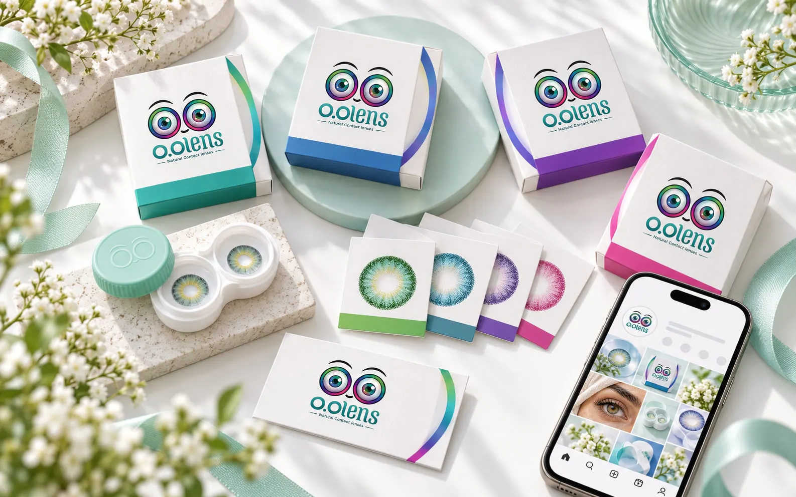
O.O Lens brand pieces laid out together: boxes, lens case, cards and a phone A woman in natural daylight wearing a subtle O.O Lens shade
02

The name: two eyes and a clear category

We created the name, starting from the eyes: two O's side by side read as a pair of eyes and point straight to what the brand is about. Adding “Lens” makes the product category clear from the first read, so the name and the symbol became one idea that carries into the identity and the packaging.

A name where the eyes appear before the reading is finished.

  • O.O: two eyes side by side
  • Lens: the category, stated clearly
  • One idea for the name and the symbol
03

The idea behind the logo

The two O's of the name became two open eyes. The iris ring around each eye carries the shades, and a small smile between them keeps the brand warm.
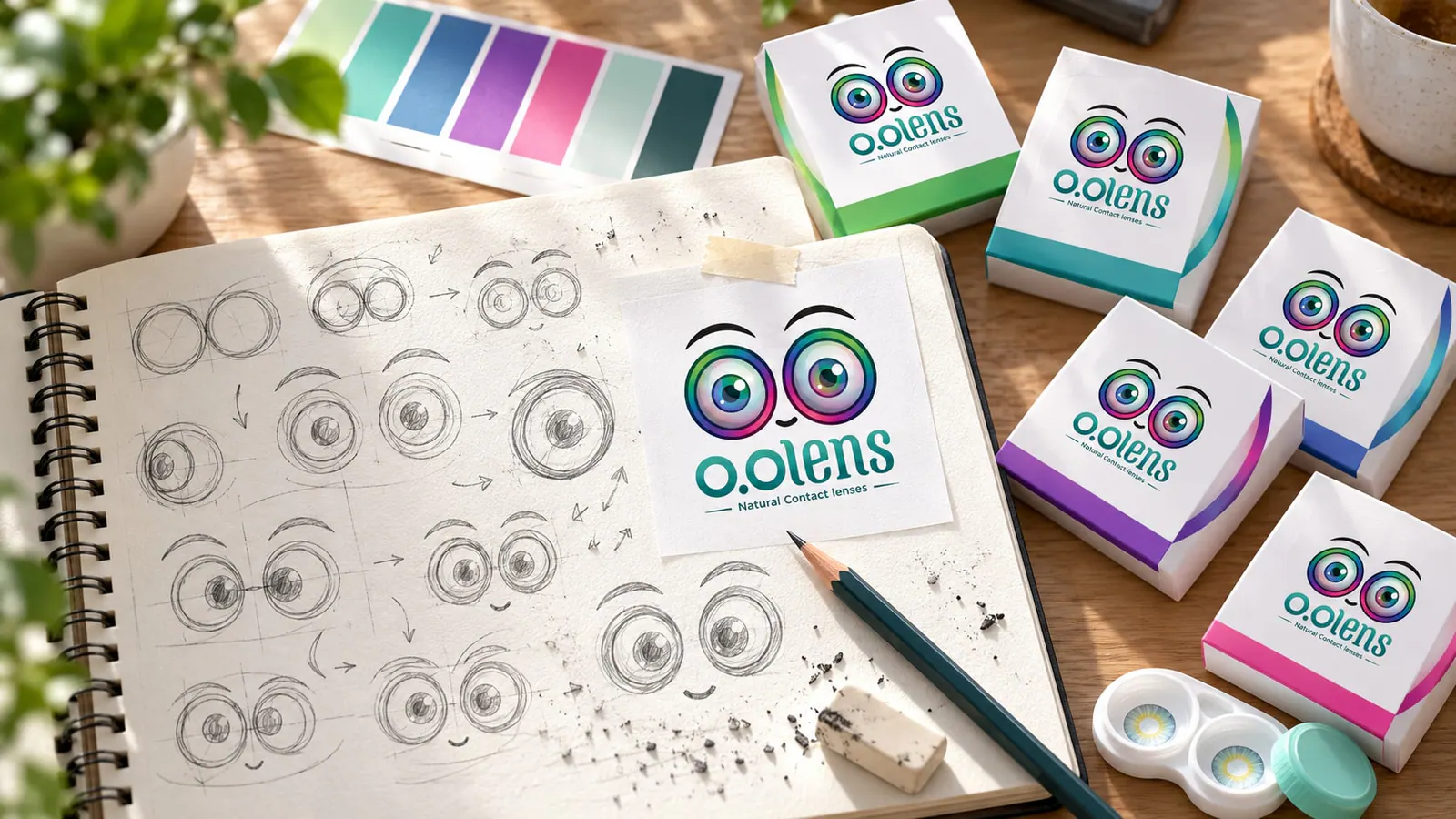
  • The two O's as eyes
  • The iris ring as the shade range
  • A smile for a friendly tone
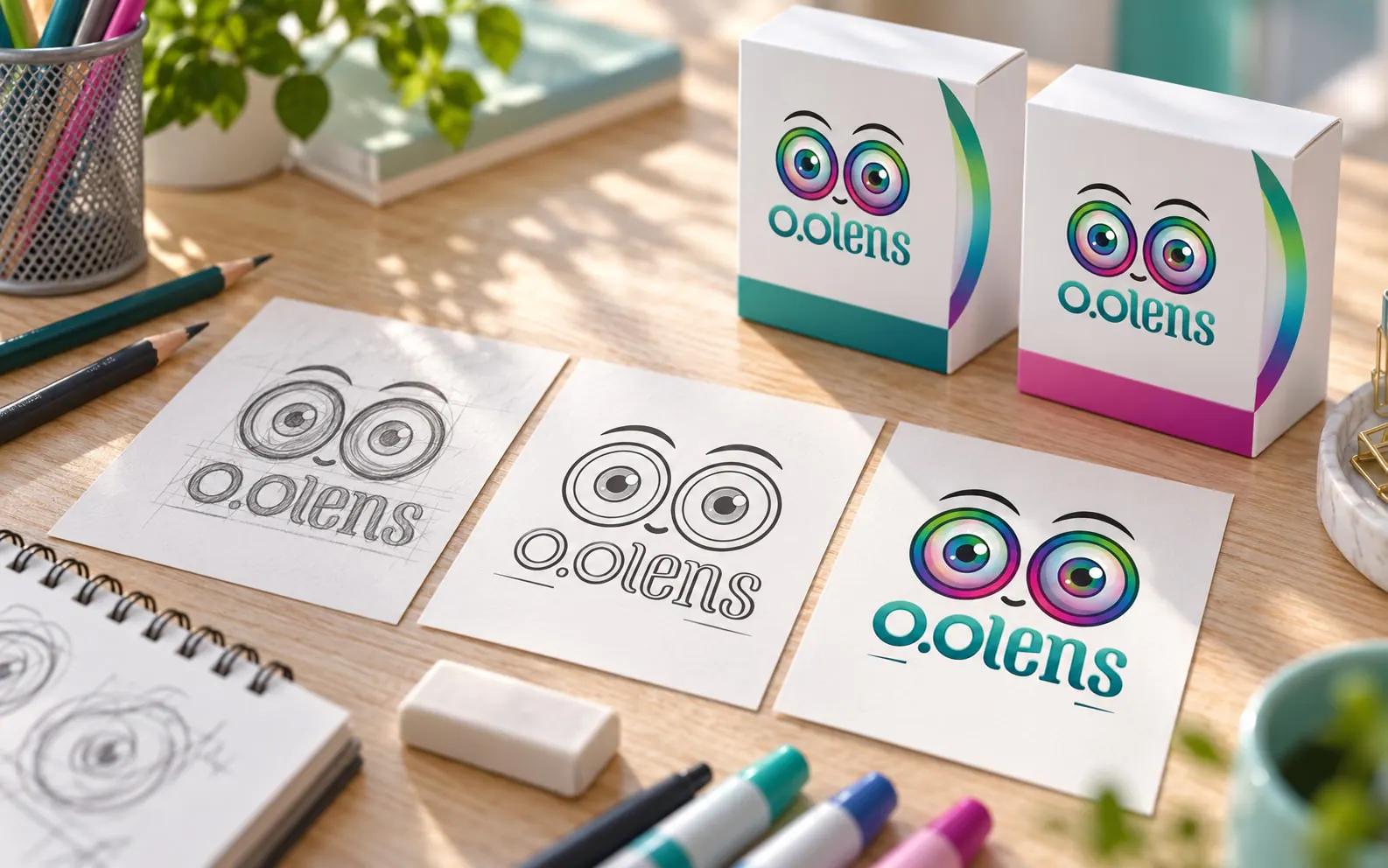
  • From sketch to final mark
Pencil sketches of the O.O Lens eyes and smile in a designer's notebook O.O Lens logo construction with circles, grid and clear space Three steps from the first sketch to the final O.O Lens logo
04

The iris ring as the brand's colour signature

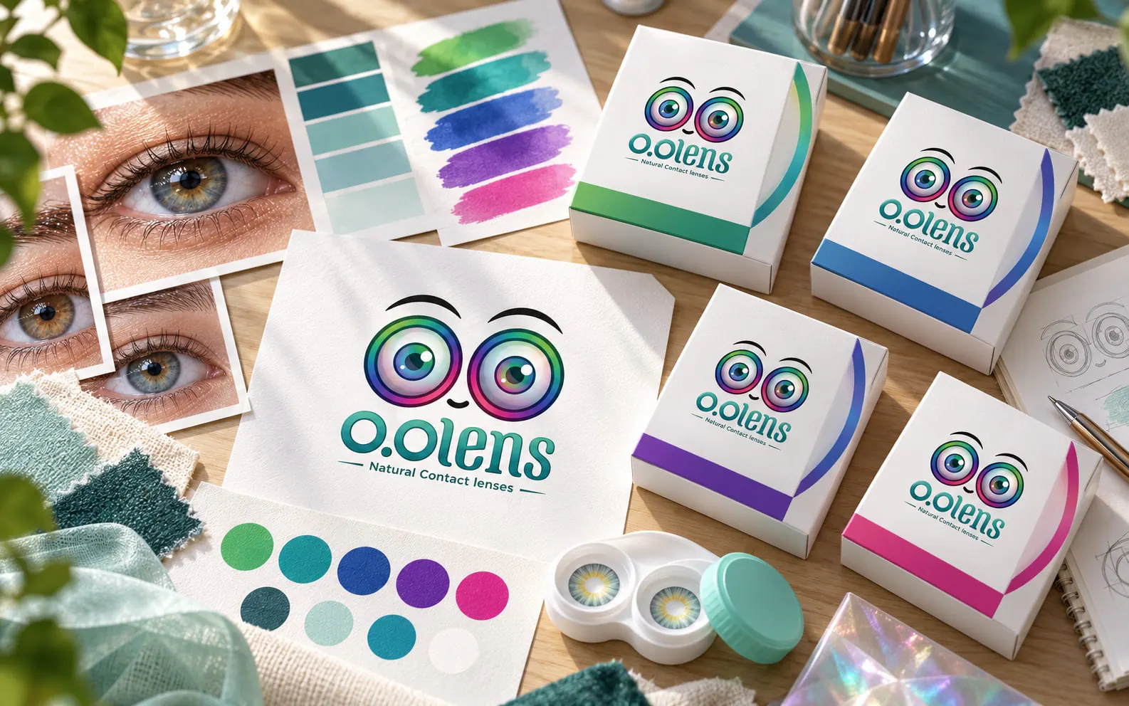
The gradient of the iris ring, from green through teal and blue to purple and pink, is the signature. The teal of the wordmark carries the everyday text and surfaces.
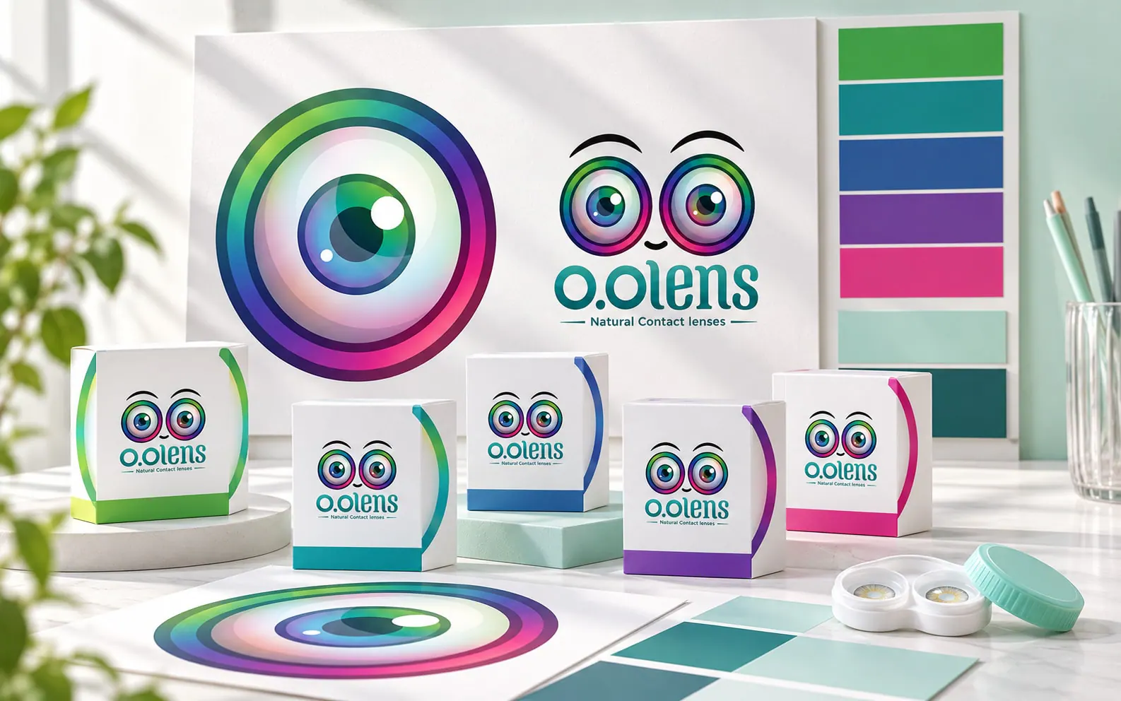
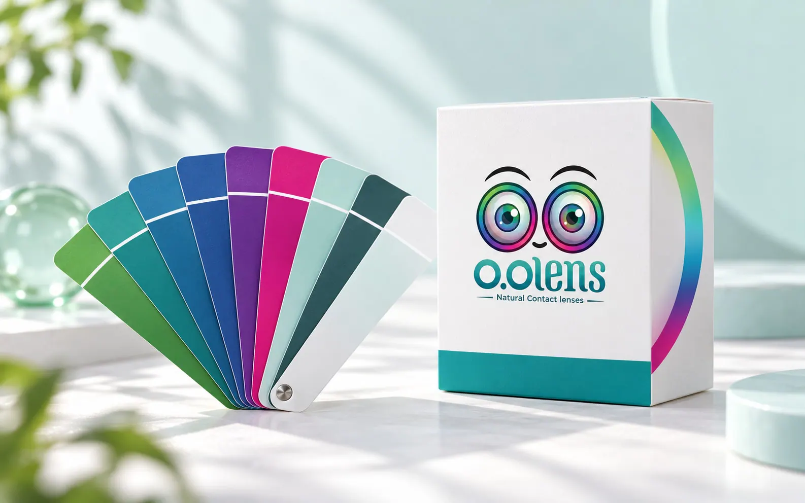
  • Iris green#51A95D
  • Iris teal#2E818B
  • Iris blue#37589E
  • Iris purple#603B96
  • Iris pink#D32485
  • Wordmark teal#1A7C7B
  • Light teal#5CB597
  • Mint#C6E3DF
  • Deep teal#32595B
O.O Lens colour board built around the iris-ring gradient O.O Lens colour swatches fanned out beside a shade box
05

Typography and identity elements

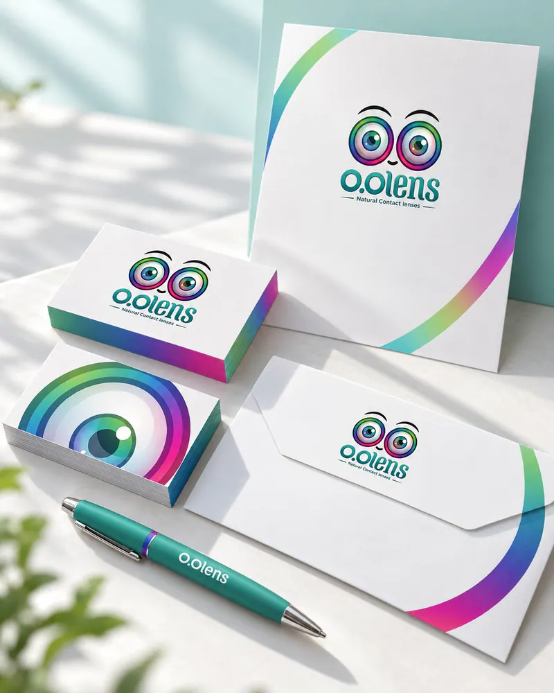
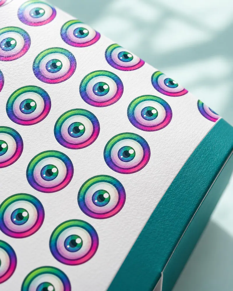
Rounded type that matches the wordmark, a pattern drawn from the iris ring, a simple icon set and stationery that carry the same friendly look.
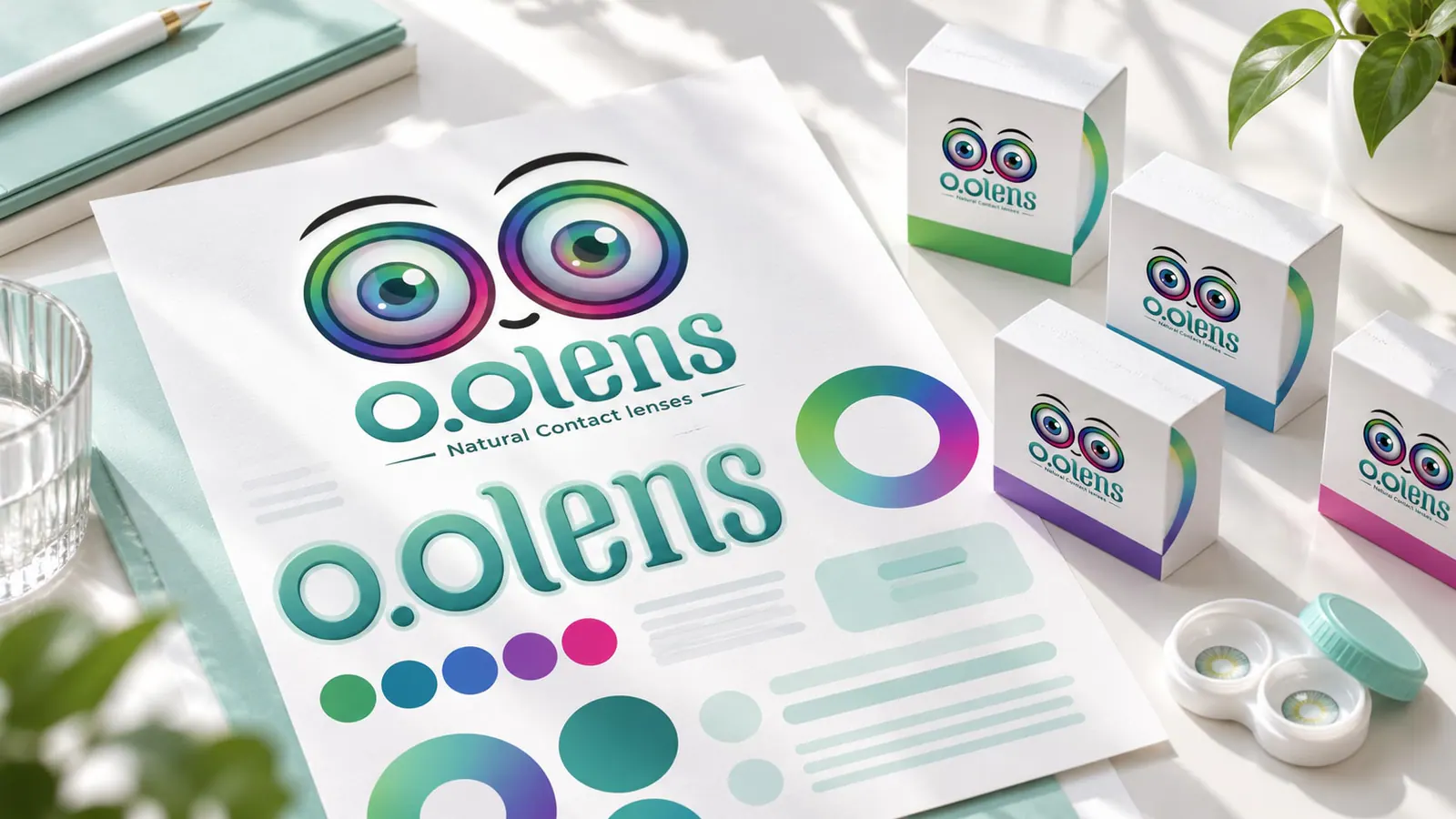
  • Type pairing
  • Iris-ring pattern
  • Icon set
  • Stationery
O.O Lens typography board with the wordmark and supporting type A pattern of iris rings printed on paper O.O Lens icon set in teal line style O.O Lens business cards, letterhead and envelope
06

Packaging with a colour code for every shade

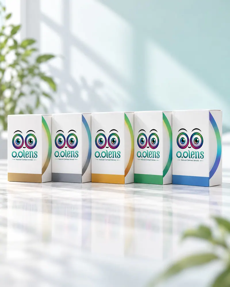
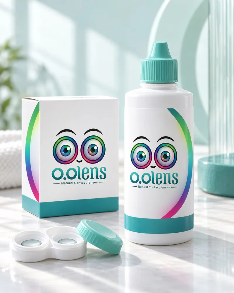
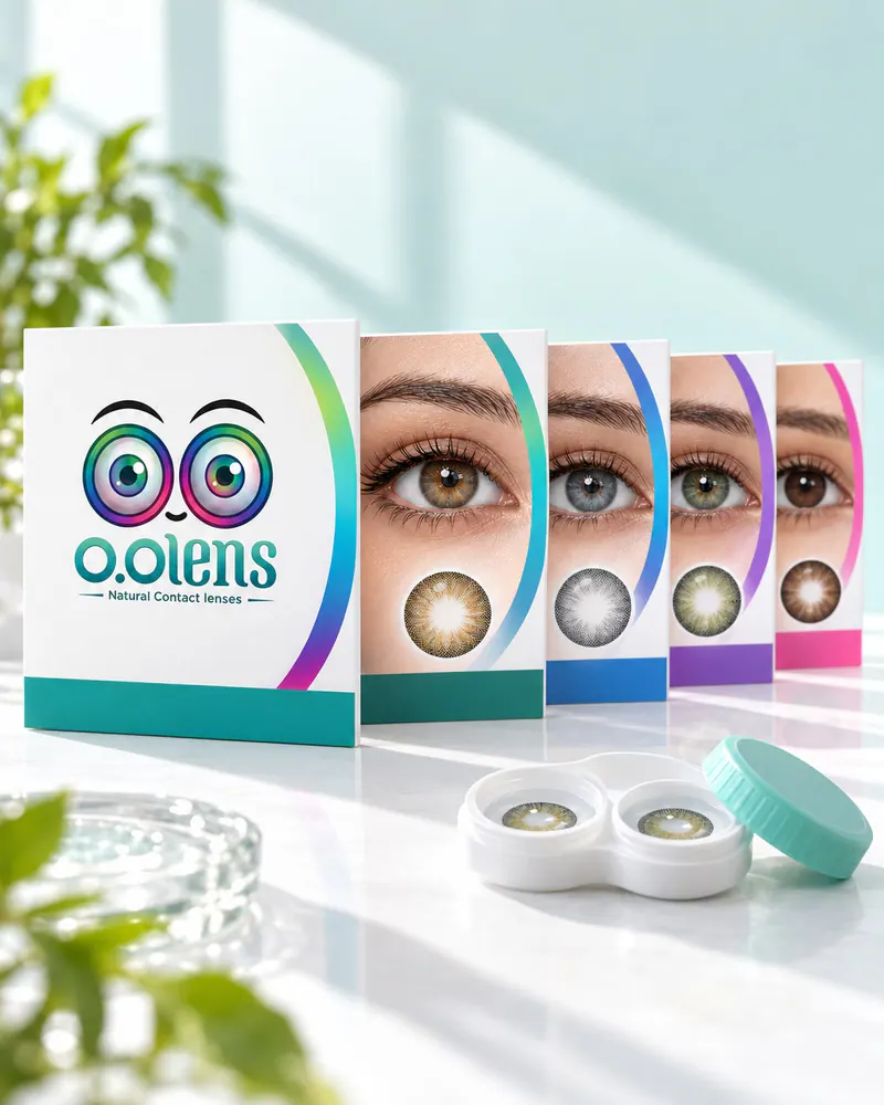
Product and packaging design as one white family with the iris ring on the edge. Each shade has its own colour dot and band, so the right box is easy to find on the shelf and at home.

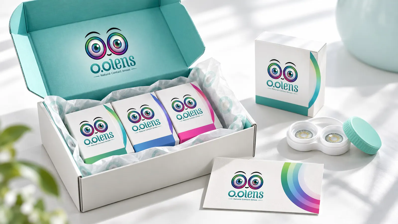
Shipping and gift boxes extend the same system to deliveries and gifting.
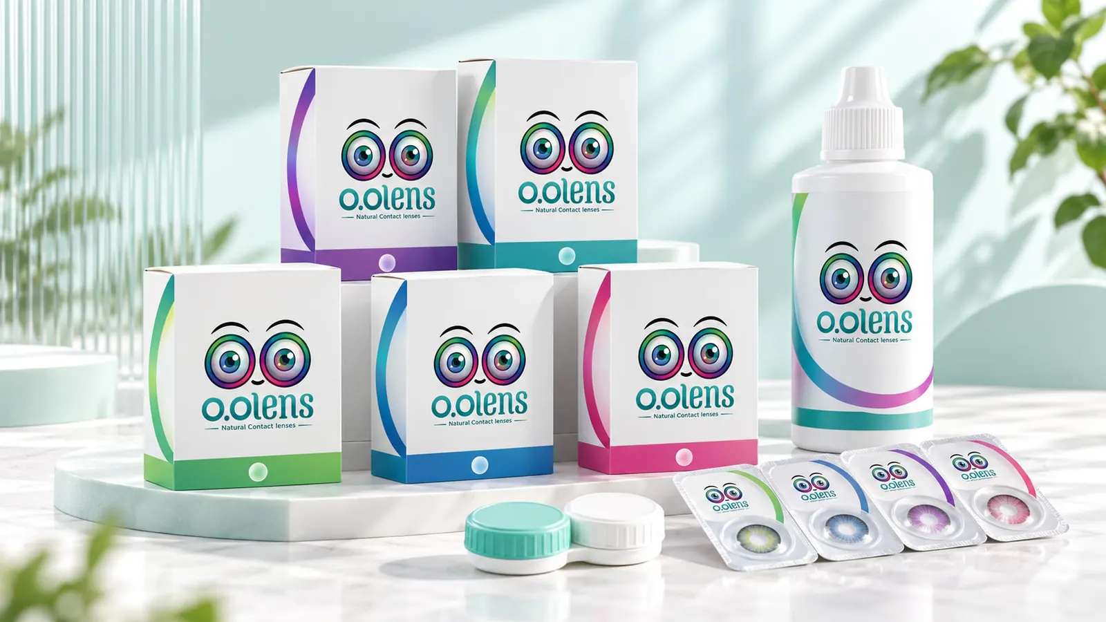
  • Lens boxes
  • Colour coding per shade
  • Blister packs
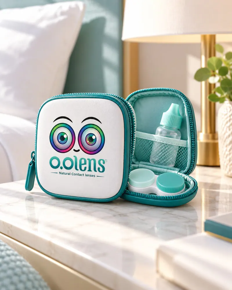
  • Lens case
  • Solution bottle
  • Shipping and gift box
The O.O Lens packaging family lined up on white O.O Lens boxes side by side, each with its own shade colour O.O Lens blister packs with a shade-coloured foil band An O.O Lens lens case in teal and white An O.O Lens solution bottle with the iris-ring label
An open O.O Lens shipping box with shade boxes and a thank-you card
07

The shade collection

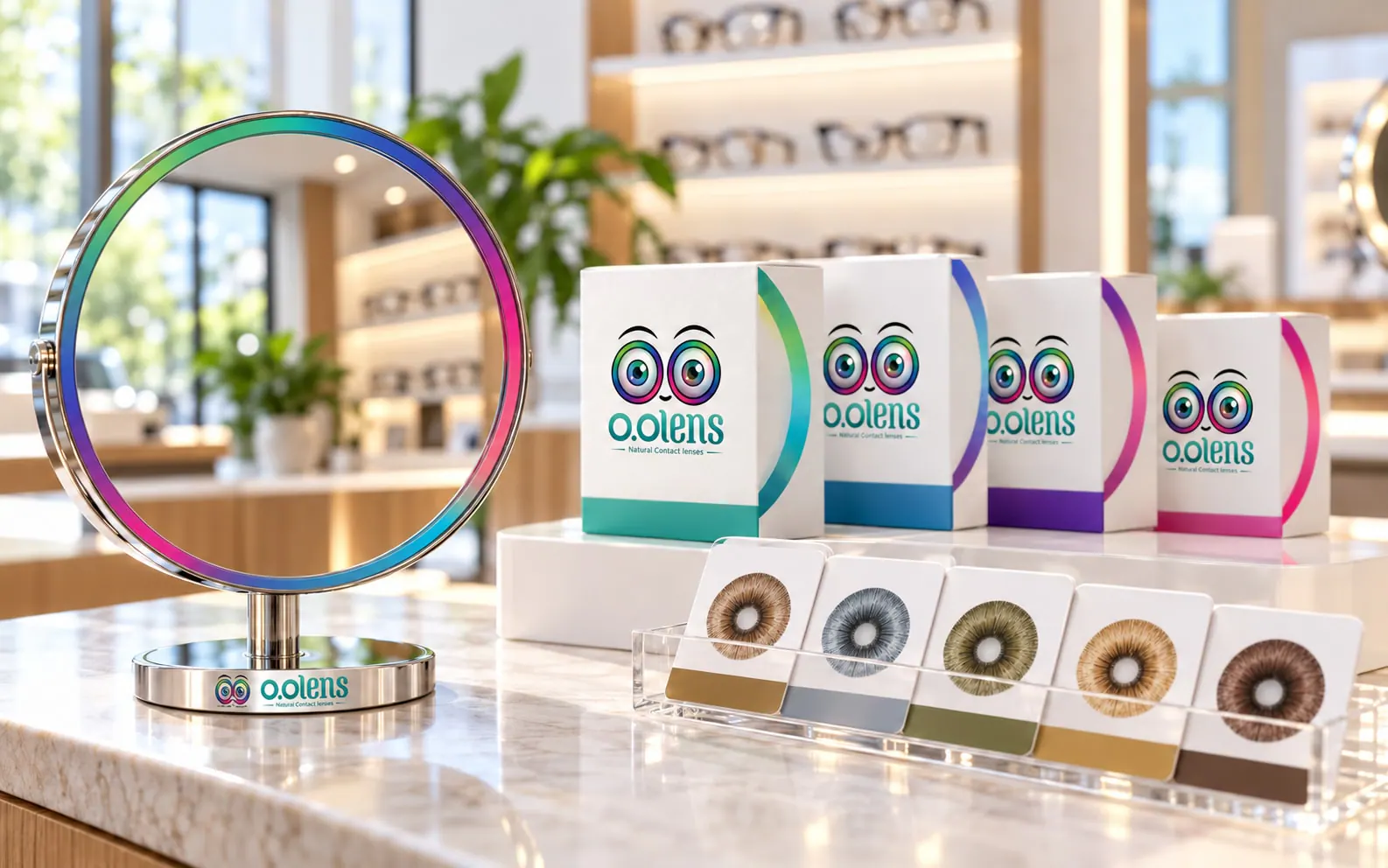
Every shade is shown on its own box and on a swatch card, so people can compare shades side by side.
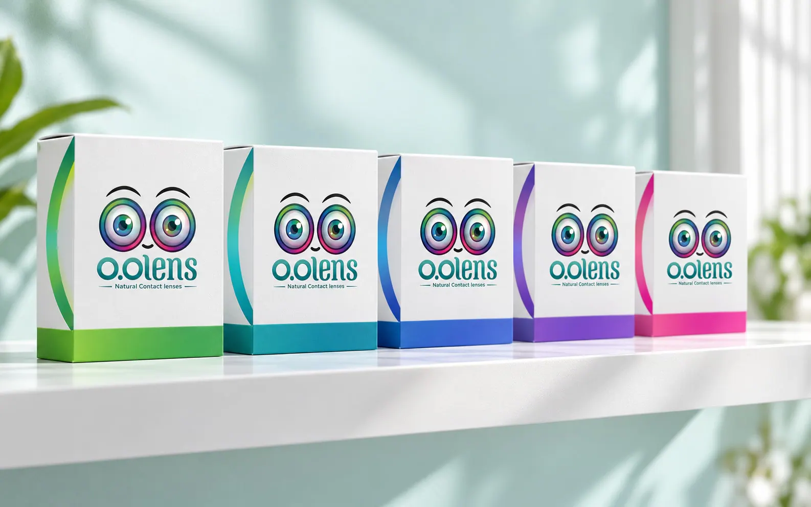
The O.O Lens shade boxes lined up in one row O.O Lens shade swatch cards with a lens image on each
08

Photography and art direction

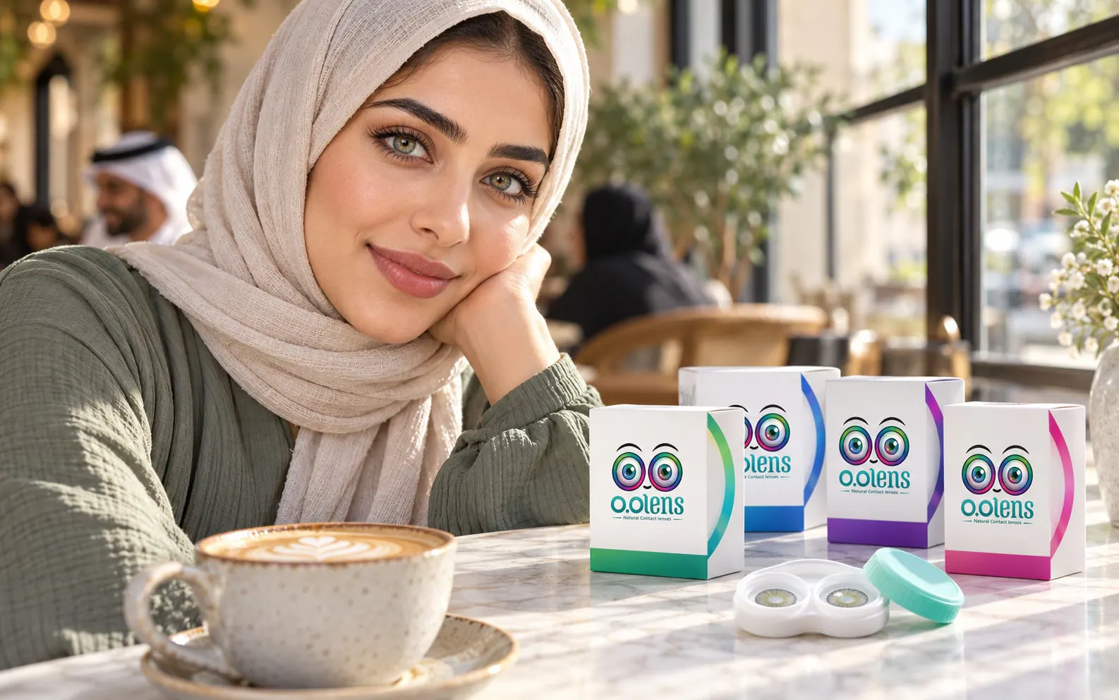
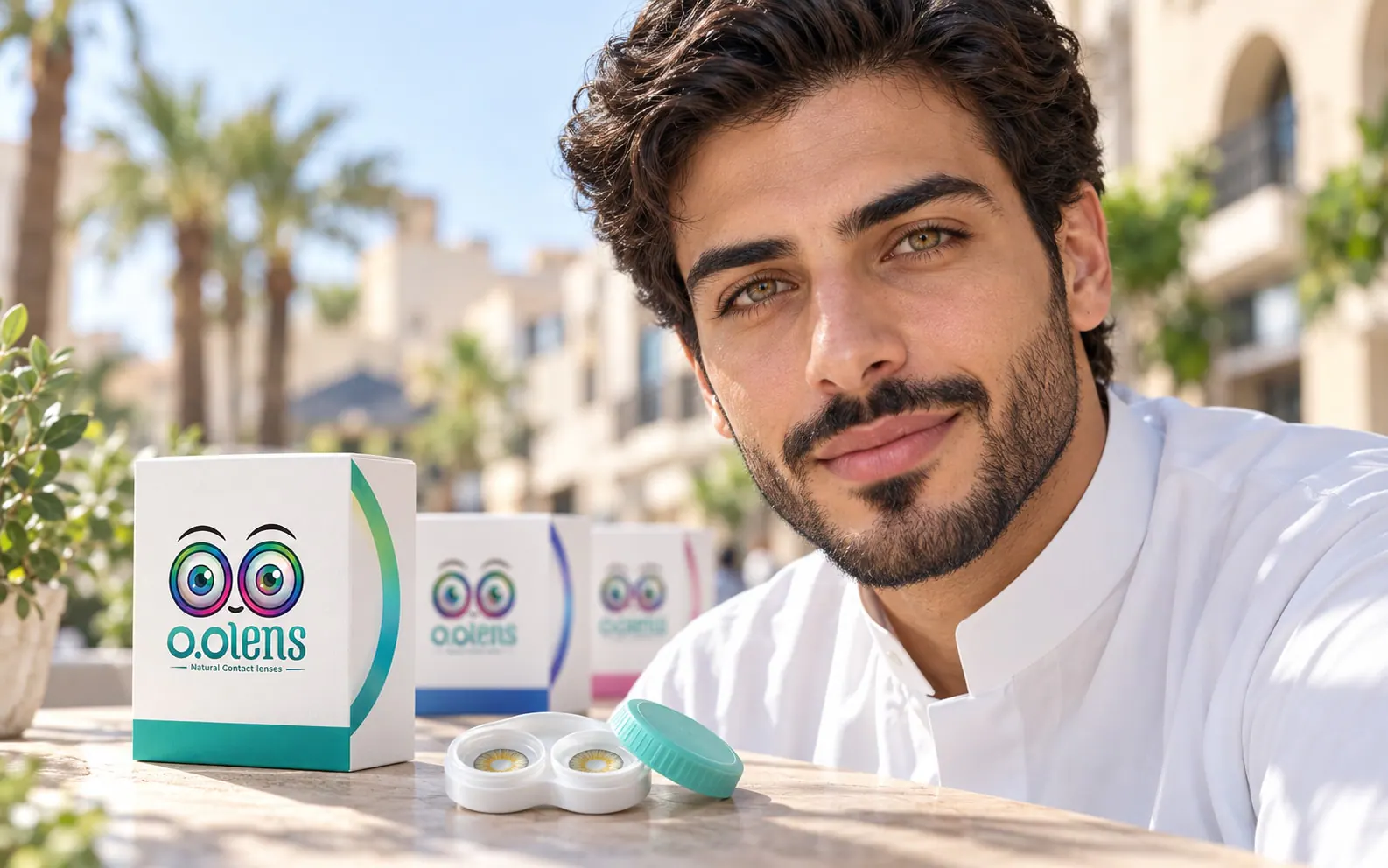
We handled content production, photography and design. Daylight, real skin and close-ups that let the shade speak. Women and men in everyday settings, with the eyes and the product at the centre.

Portraits in natural light keep the look modest and real.

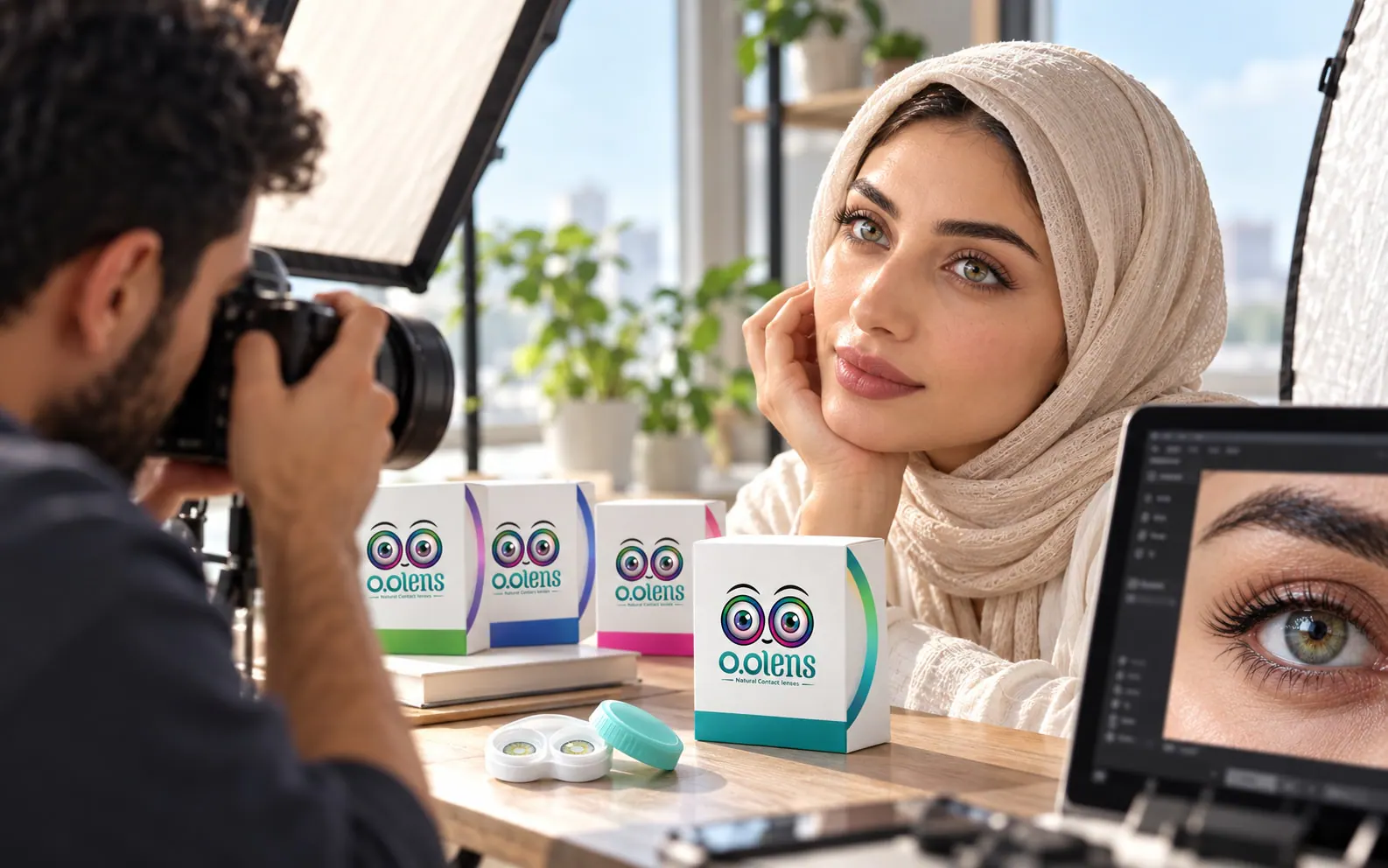
Light, styling and framing were set on a mood board before the shoot and followed on set.
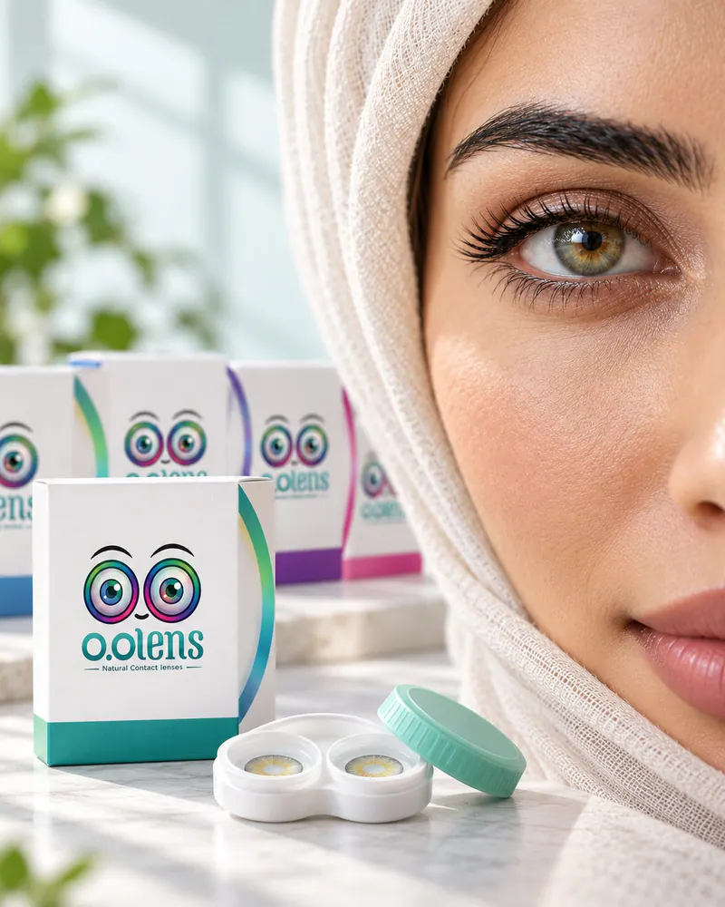
Close-up of an eye wearing a hazel O.O Lens shade Close-up of an eye wearing a grey O.O Lens shade Close-up of an eye wearing a green O.O Lens shade
A woman in a café in daylight wearing an O.O Lens shade A man outdoors in daylight wearing an O.O Lens shade
  • Daylight direction
  • Casting and styling
  • Eye close-up framing
  • Shot list and selects
Behind the scenes of the O.O Lens shoot O.O Lens art direction mood board
09

Social media

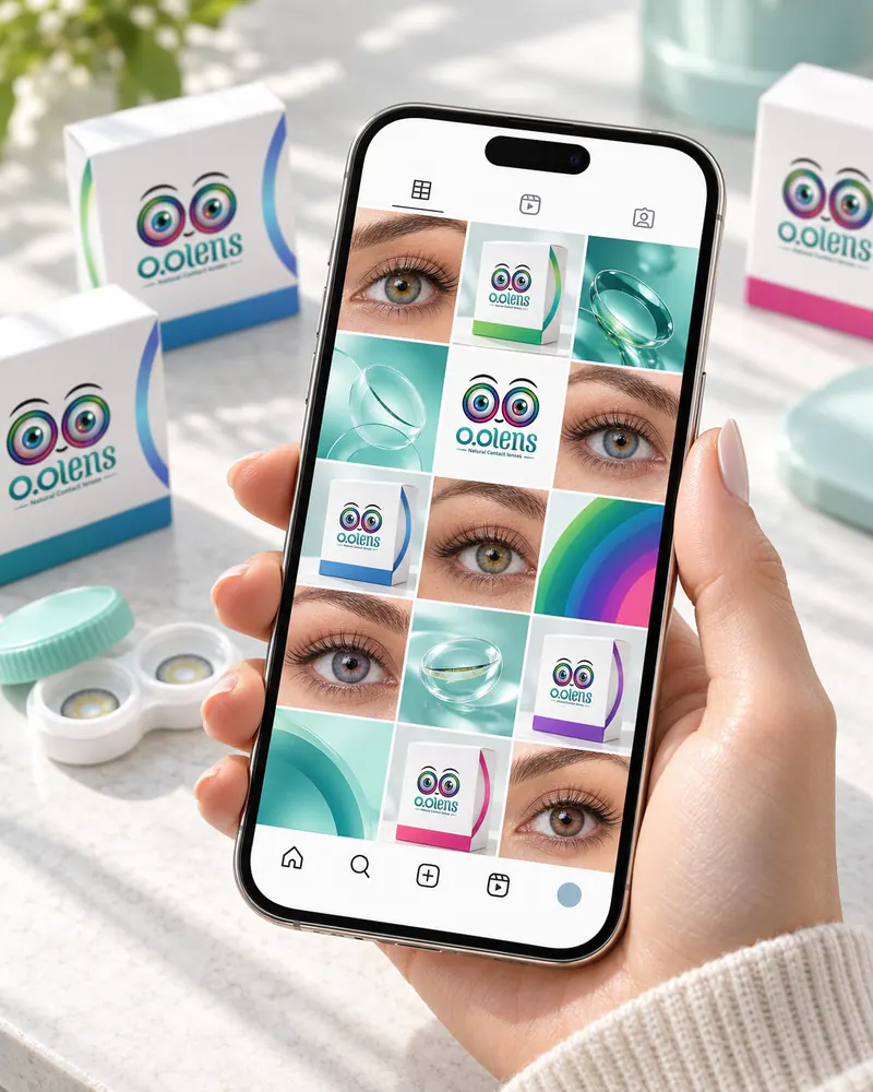
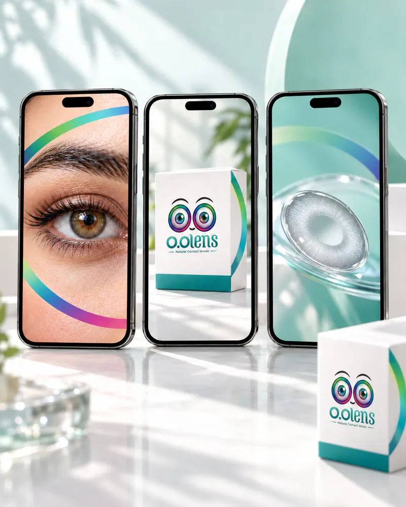
Social media run from research and a plan to content, day-to-day management and campaigns. A feed built on the shades: close-ups, shade guides in carousels and stories that keep the iris ring and the teal consistent.
  • Social media research
  • Content plan
  • Content and design
  • Account management
  • Social media campaigns
The O.O Lens feed as one grid on a phone O.O Lens story frames on phone screens An O.O Lens carousel laid out slide by slide An O.O Lens social post introducing one shade
10

Campaigns and ads

One key visual adapted for the street, bus shelters and phone screens. Online, the work covered social media campaigns and Google Ads.
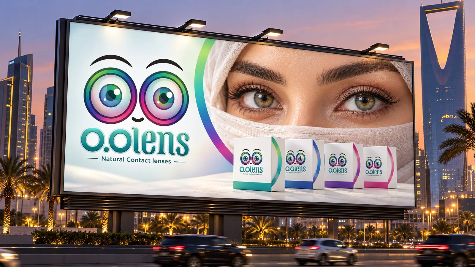
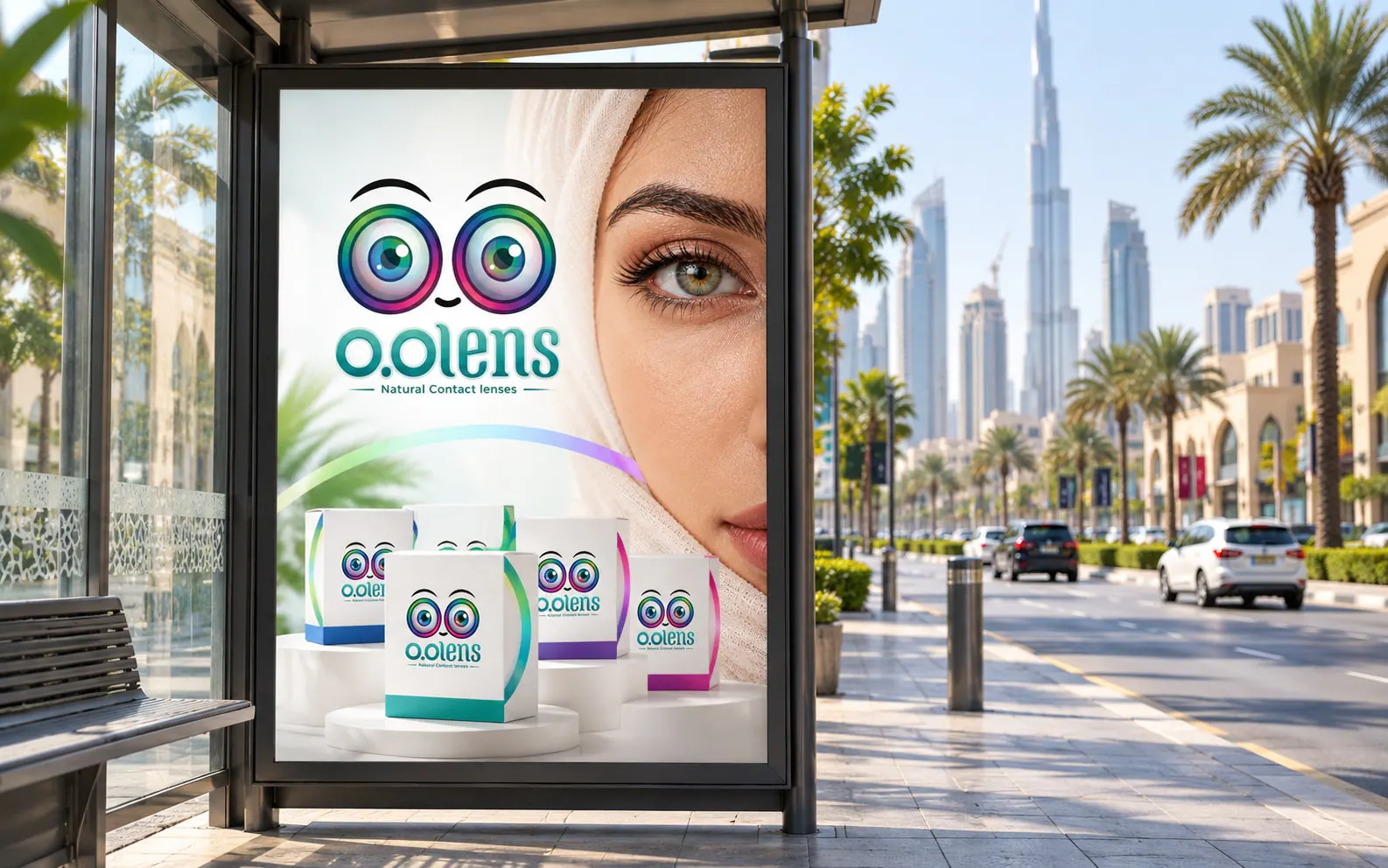
An O.O Lens billboard on a city road An O.O Lens poster in a bus shelter An O.O Lens digital ad on a phone
11

Retail and point of sale

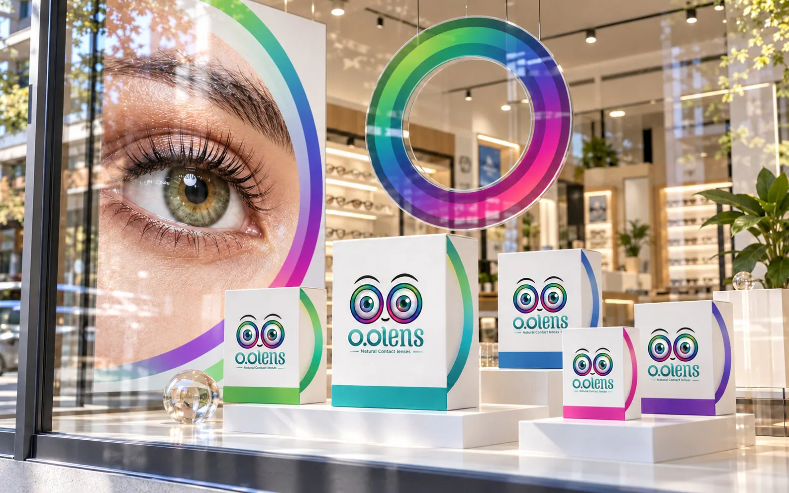
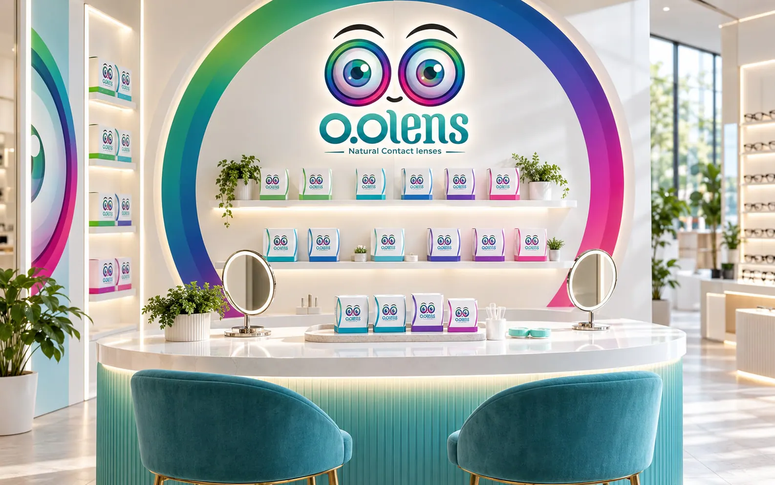
Counter displays, shelf stands, a shop window and a try-on mirror that show the shades clearly inside optical stores.
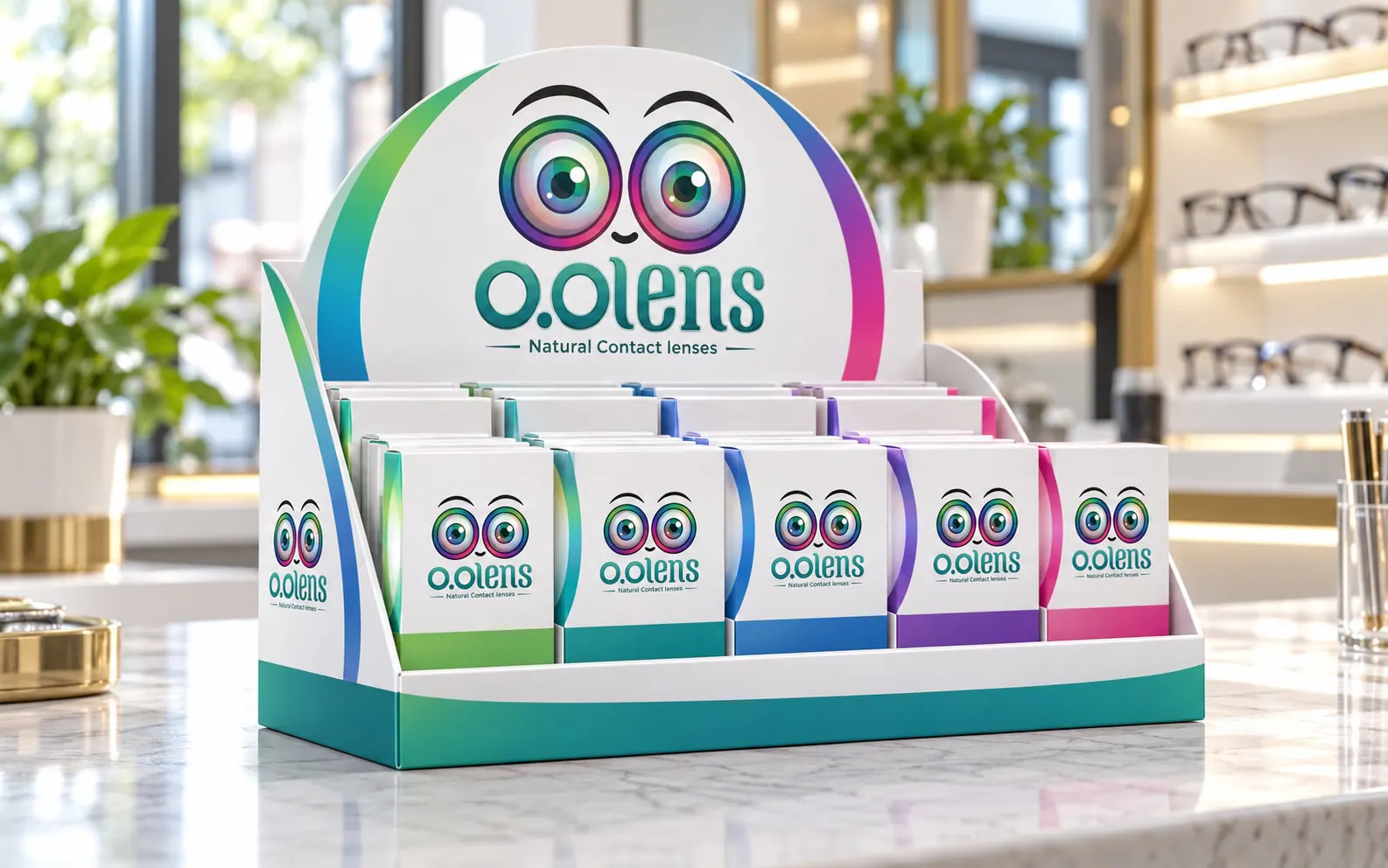
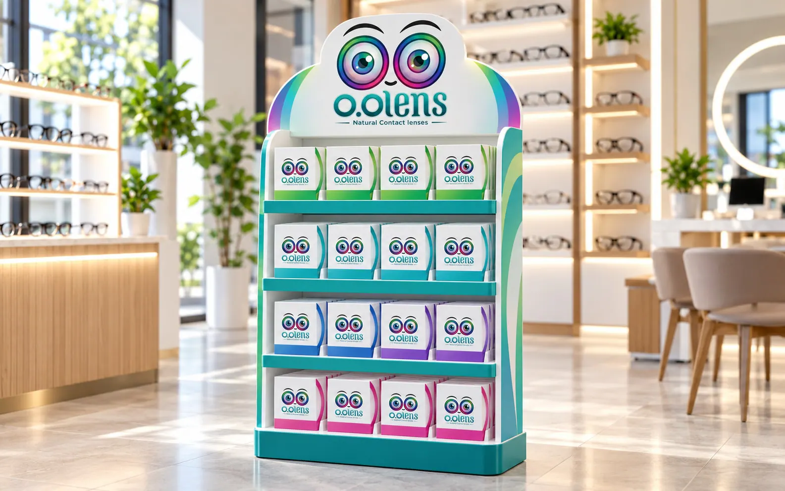
An O.O Lens counter display in an optical store An O.O Lens shelf stand with the shade collection An O.O Lens shop window display A branded O.O Lens try-on mirror on a store counter
12

The brand in the street

Delivery vehicles, bags, merchandise and an exhibition booth carry the same eyes and iris ring.
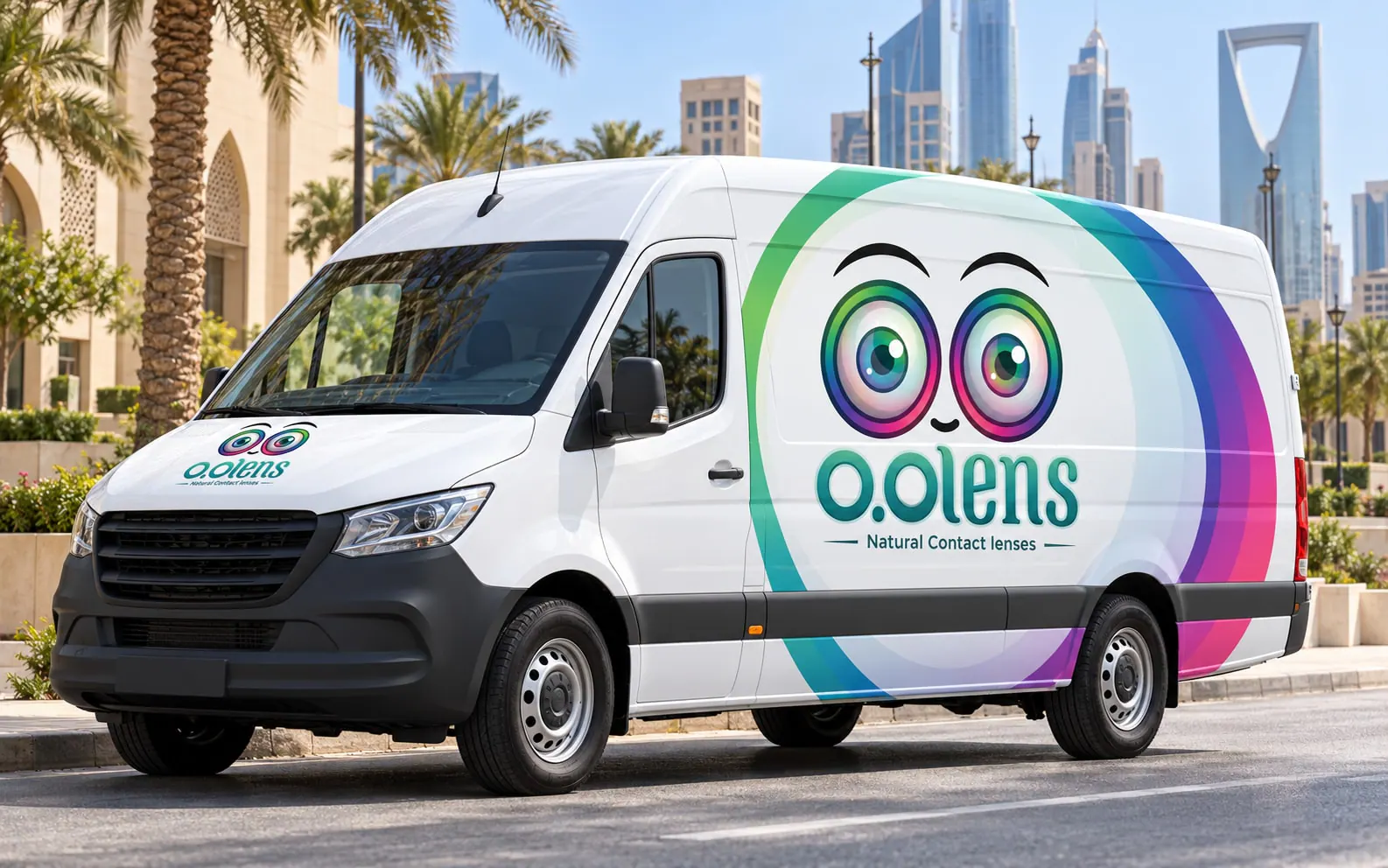
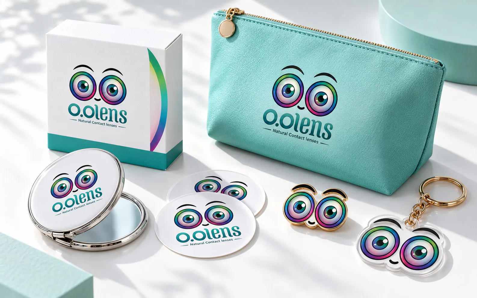
An O.O Lens branded delivery van An O.O Lens tote bag O.O Lens merchandise: mirror, pouch, stickers and pin An O.O Lens exhibition booth
13

A website for the UAE market

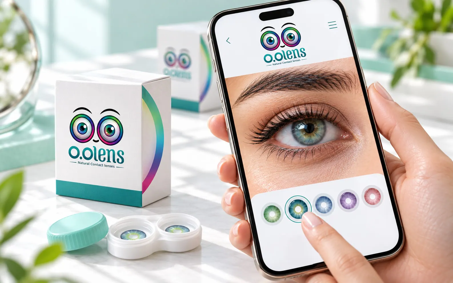
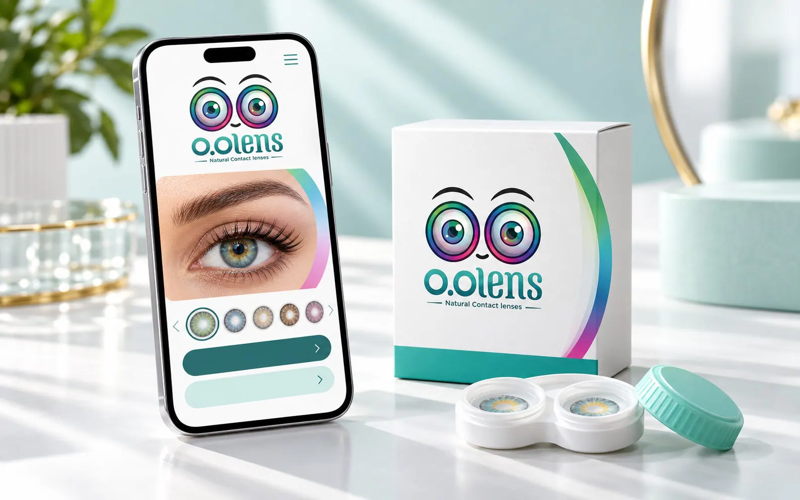
A website organised by shade, with clear photos of each lens on the eye and on the box, and a clear path to contact the brand or find where to buy. The work covered research and planning, the sitemap, content, UX and UI, design, development and SEO.
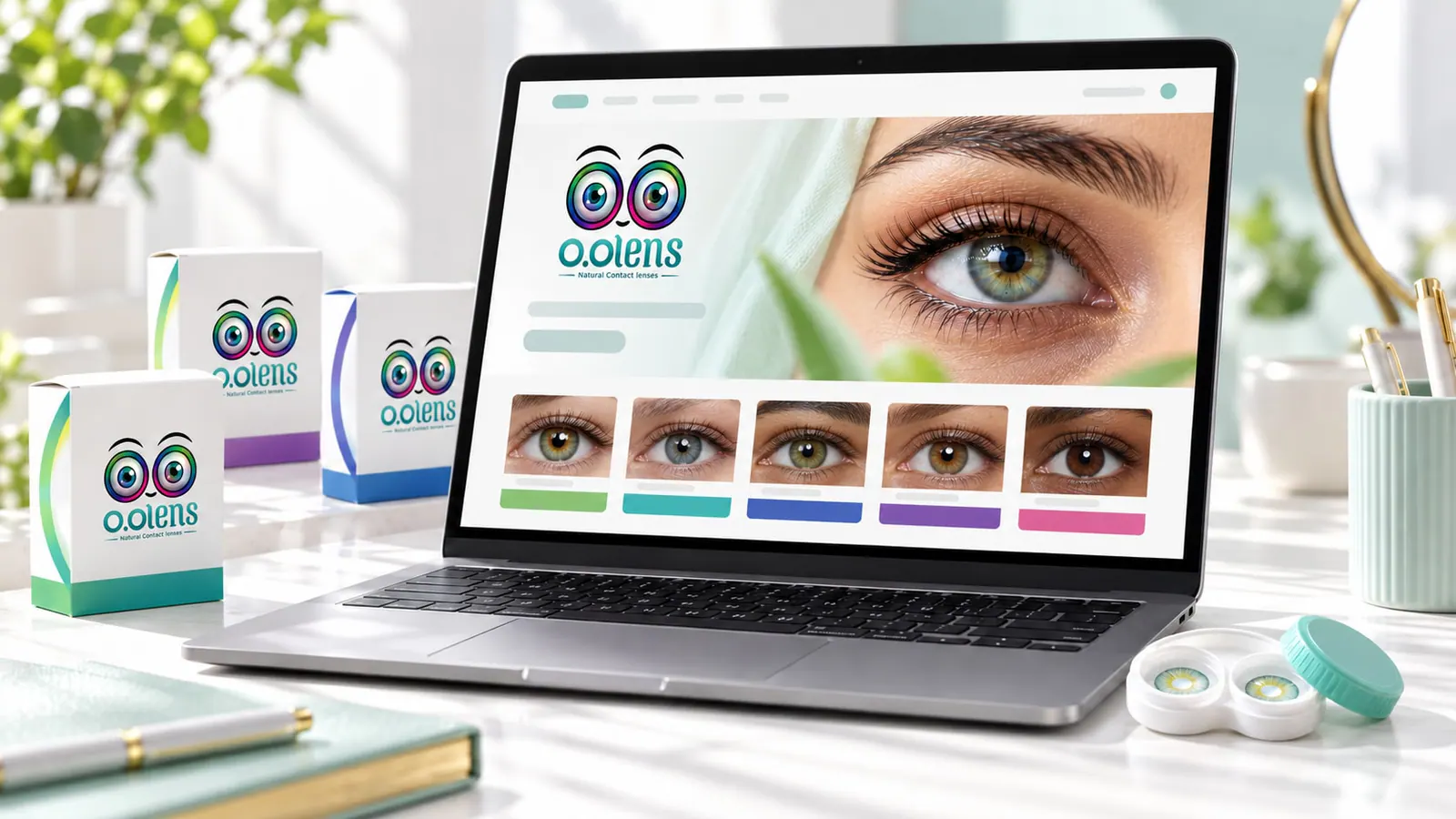
  • Research and planning
  • Sitemap
  • Content
  • UX and UI
  • Design and development
  • SEO
The O.O Lens website on a laptop The O.O Lens website home page on a phone An O.O Lens shade page on a phone
14

Suggested extras

Ideas that extend the system: a seasonal gift set, a creator kit and a travel pouch.
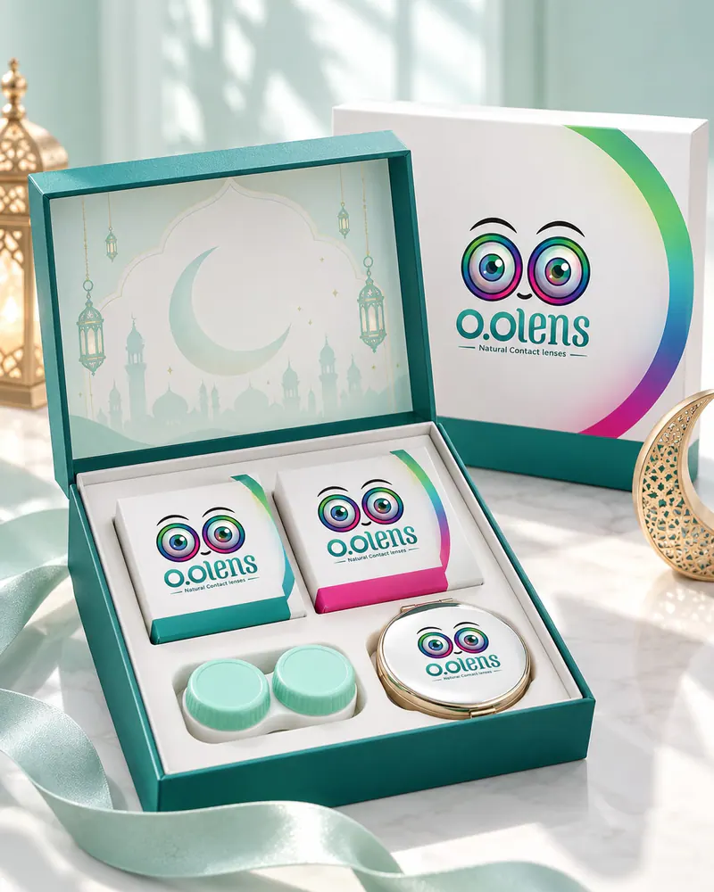
An O.O Lens seasonal gift set An O.O Lens kit box for content creators An O.O Lens travel pouch with a lens case and mini bottle
Related insights

Have a product that needs a brand people trust at first look?

Tell us what the business needs to understand, decide or change. We will review the context before recommending the next step.